Scraping German and Kiwi wine reviews to feed to Machine Learning algorithms
Scraping German and Kiwi wine reviews for some machine learning.
I’ve recently seen come cool R packages come out. rvest for scraping web data,
and two machine learning packages for prediction (FFTrees) and visualising high-dimensional data (tsne).
In order to try them out, I decided to look at wine reviews from NZ, where I was born, and my wife’s home state of
Rheinhessen.
Getting the data
The data was scraped from the website winemag.com, using the excellent rvest package,
which makes navigating and pulling elements from websites a breeze. I won’t go into methods as this post is based off things I learnt
on R-Bloggers.
Instead I’ll focus on just saying that I pulled every review on the site about NZ or Rheinhessen wines.
The prices are in euros so they mean something to me, but the price actually represents the price of the wine in America at the time of the review.
Summary of scraped data
| Colour | Place | n | Number of wineries | Median € (IQR) | Median score (IQR) |
|---|---|---|---|---|---|
| Dessert | NZ | 9 | 8 | 24 (17, 28) | 87 (86, 92) |
| Dessert | Rheinhessen | 18 | 12 | 32 (28, 57) | 88 (85, 91) |
| Red | NZ | 1252 | 296 | 25 (18, 36) | 88 (86, 90) |
| Red | Rheinhessen | 37 | 15 | 13 (11, 18) | 86 (85, 89) |
| Rose | NZ | 6 | 5 | 14 (11, 14) | 84 (84, 85) |
| Rose | Rheinhessen | 4 | 4 | 13 (12, 17) | 83 (81, 86) |
| Sparkling | NZ | 7 | 4 | 31 (28, 32) | 88 (87, 90) |
| Sparkling | Rheinhessen | 2 | 2 | 22 (21, 22) | 86 (84, 88) |
| White | NZ | 1817 | 321 | 16 (14, 20) | 88 (86, 89) |
| White | Rheinhessen | 322 | 62 | 16 (12, 23) | 88 (86, 90) |
Caveats
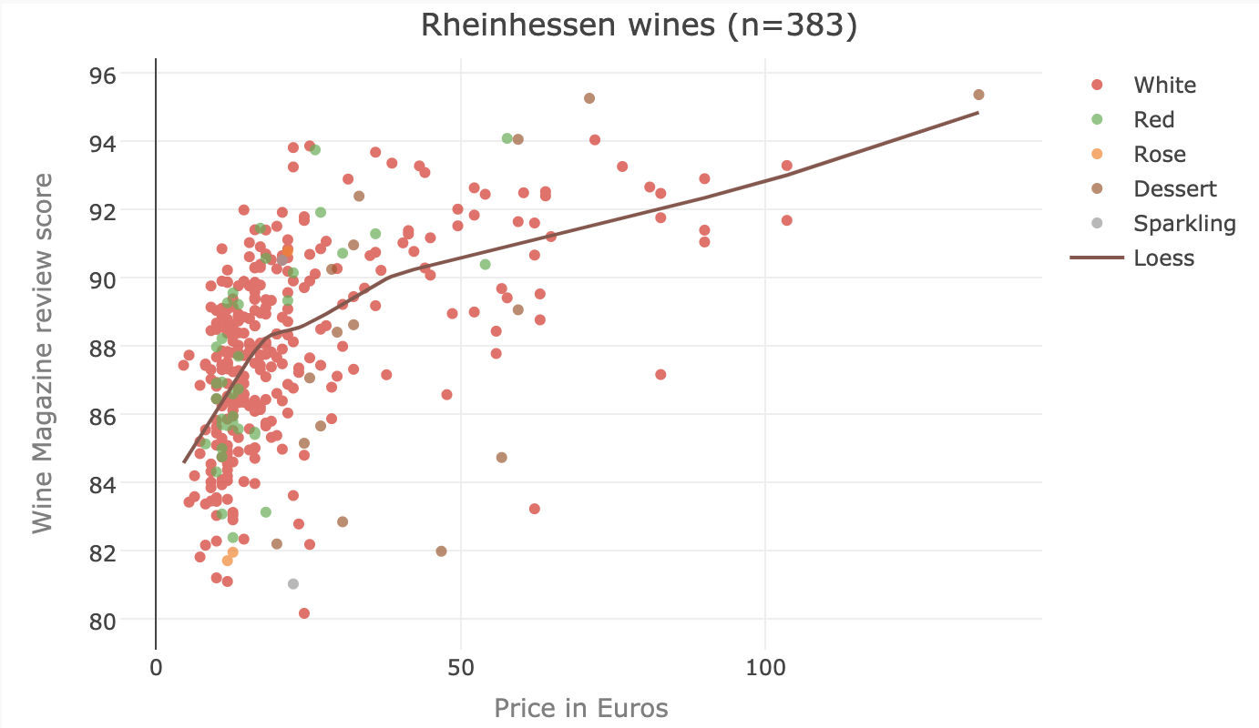
This is convenience data… prices are based on the price in the US, and there is likely some bias in what wines are available in the US, and then which of the wines on the market have then been reviewed. A huge caveat when I talk about score and price is that the reviews are unblinded. So scores are likely not down to just taste, but also influenced by the price, marketing, etc.
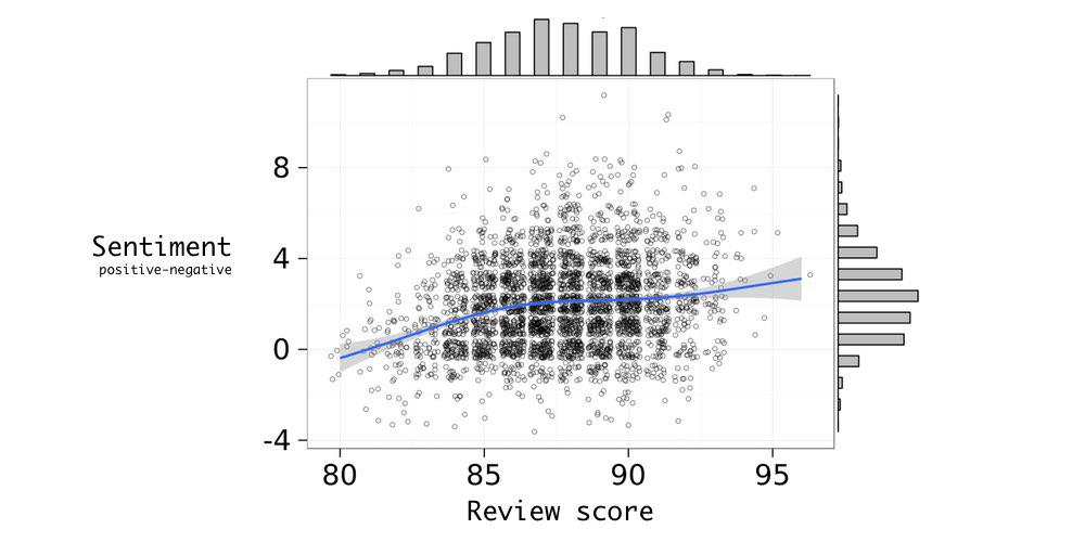
To emphasize the caveats I’ll be glossing over later - the plot below shows the price against the review score, for Rheinhessen wines. The two variables are associated, in that increasing score often suggests a higher price - but here the reviewer is stating the price of the wine at the time of review (so the price comes before the review) - and the reviewer’s score is probably, subconsciously or not, influenced by the price.
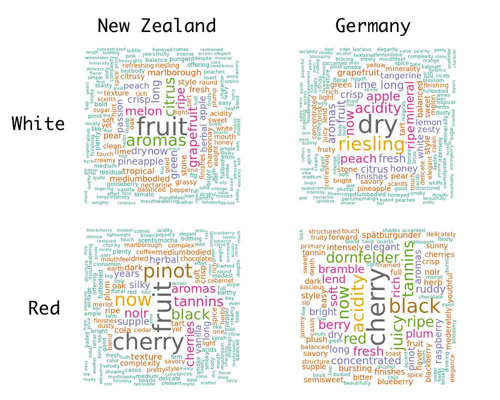
NZ vs. German wordcloud
Worldcloud’s are a way to show frequency, with less accuracy than a table or barplot, but in a much more readable way. The following is a wordcloud of all the Rheinhessen and NZ reviews, for red and white wines. It looks like cherry is a common taste from the red wines, while for some reason fruit is common in reviews about NZ wines, but not in Rheinhessen wines.
Review scores and adjectives?
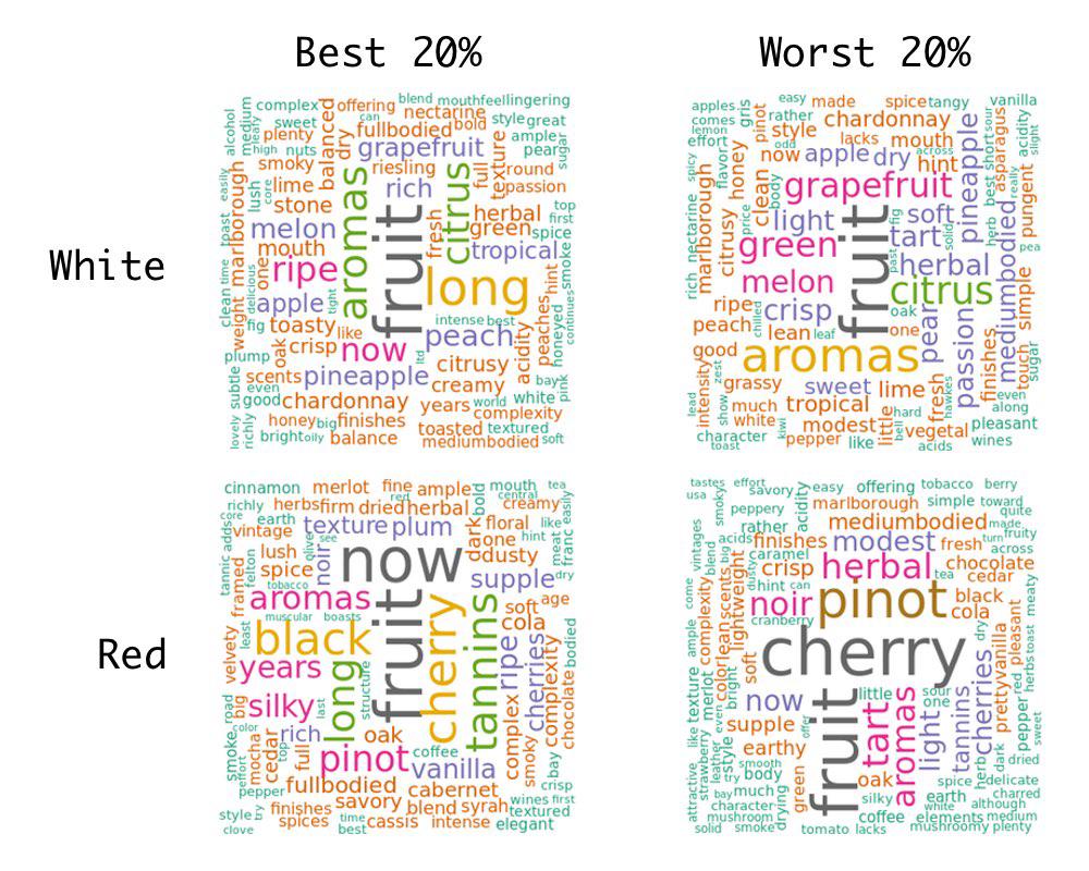
Because I have the review scores, I can look at the wordclouds by whether they fall into the top 20%, or bottom 20% of scores. The following is based off only NZ wines.
It would be very subjective to conclude anything from this, but I liked that the presence of the word long in good NZ red wines, and crisp in less good red wines, aligned with my own preference for heavier reds.
Sentiment of reviews
I wanted to look at the sentiment of reviews - so I took the simplest method possible. I took the 6,800 positive and negative words identified in the paper below:
Minqing Hu and Bing Liu. “Mining and summarizing customer reviews.” Proceedings of the ACM SIGKDD International Conference on Knowledge Discovery & Data Mining (KDD-2004, full paper), Seattle, Washington, USA, Aug 22-25, 2004.
And then calculated the sentiment score by subtracting the number of positive words in each review by the number of negative.
Below is a plot showing the rather uninformative relationship between my new sentiment score and the review score.
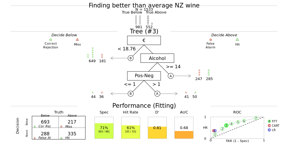
Identifying a ‘better than average’ wine
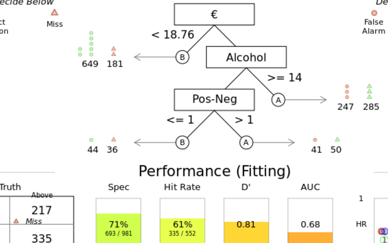
I pulled this wine data as I wanted to try out some machine learning techniques. One technique I’ll play with is the Fast and Frugal Tree - essentially, I’m building a decision tree to filter down to what I want in the minimum number of binary decisions. Such a method is designed as a tool to help things like clinical decision making - where rather than calculating an abstract risk score, a decision tree is a more tangible process to understand when stratifying patients.
In the tree below it looks like the quickest way to weed out a ‘better than average scored wine’ is to pay more than €18.76, and make sure the alcohol is >14%. If you can make a third decision, your chances of getting a good wine can be increased by only taking ones where the positive words substracted by the negative words in the review is greater than 0. In this model, less than 5% of wines are left after making three decisions, so colour (type of wine) and year of bottling don’t make the tree (I set the tree to end at either 5% left, or four decisions).
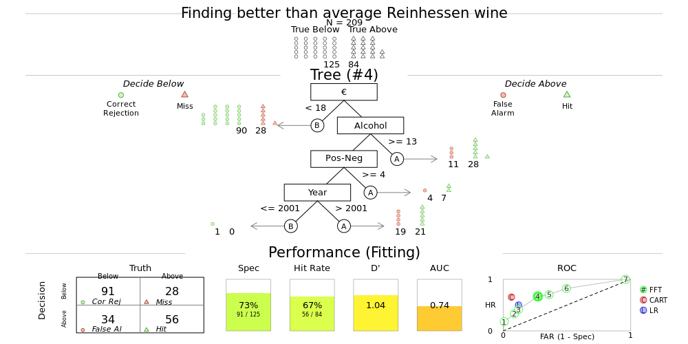
In Germany, the tree looks a little different. Price and alcohol are again the two first steps to narrow down the search for good wine,
and the cutoffs are similar, but the cut off for positive - negative words in the review is much higher, and even after three steps
there is enough uncertainty left that you can refine your search even more by taking wines made after 2001. Again - colour doesn’t feature,
but then the German wines in the sample were mainly whites.
Collapsing dimensions
Disclaimer - this is a toy example… the following exists as I want to try out different machine learning algorithms..
I have pulled some ‘high dimensional data’ (I know it’s not really - but still, it’s the best I can do on a Sunday morning of recreational coding), that I now want to cluster. While there are crude methods like k-means for clustering, the standard method (and this is debatable) would be Principal Components Analysis (PCA). In PCA you reduce the dimensions by building a linear projection of your data, that maximises the variance. I’m an epidemiologist not a statistician, so take this summary as unreliable, but I think of it as building the worse model possible, that spreads your data out as much as possible pair wise.
But - is it reliable to maximise just the pairwise differences? An alternative method, t-Distributed Stochastic Neighbor Embedding (tsne), attempts to spread the data while preserving local pairwise relationships. tsne measures similarities between points, looking only at similarities with local points by centering a gaussian over a point, then looking at density of surrounding points and re-normalise - producing a probability distribution where the probability is proportional to the similarity of the points.
Below is a tsne plot of the NZ and Rheinhessen wine data - where the tsne algorithm was blinded to the colour of the wine, and if it was from New Zealand or Rheinhessen. Interestingly, based off price, score, year bottled, alcohol percentage and sentiment the method (and this is very subjective) identified a cluster of NZ reds with Rheinhessen whites in the top left. While Rheinhessen whites and sparkling wines managed to cluster in the bottom right, without the algorithm knowing either country or type.
When I let the tsne algorithm know the country, it of course gets much better at clustering the data. Interestingly there appears to be some separation of NZ reds and whites. The next step would be to explore these clusters, but as Sunday morning has now slipped away, I might save that for another post.
James Black
PhD (Cantab)
James Black. Kiwi | Epidemiologist | Data Scientist | Engineering enthusiast.