Restaurant hygiene ratings in Cambridge
Plotting Cambridge restaurant cleanliness using R.
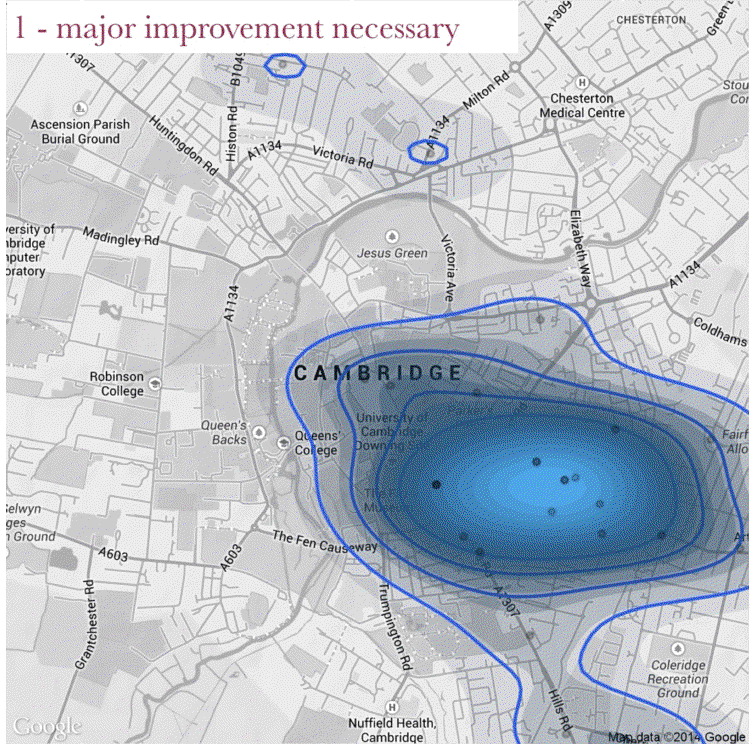
Above is a plot of the restaurants in Cambridge that have a food safety rating of one. I’ve manually moved the labels so none overlap, which means the locations are approximate. This plot is the last one from the analysis below.
This plot was made after a friend pointed out the Food Standards Agency publishes their data, so anyone can go to their open data site and download away. So, after downloading the file, I copied it across to a csv (it comes as xml).
Then, I load up the packages and the data file I’ll be using.
require(ggplot2)
require(ggmap)
require(devtools)
library(RColorBrewer) # scale colours
setwd("folder to output to")
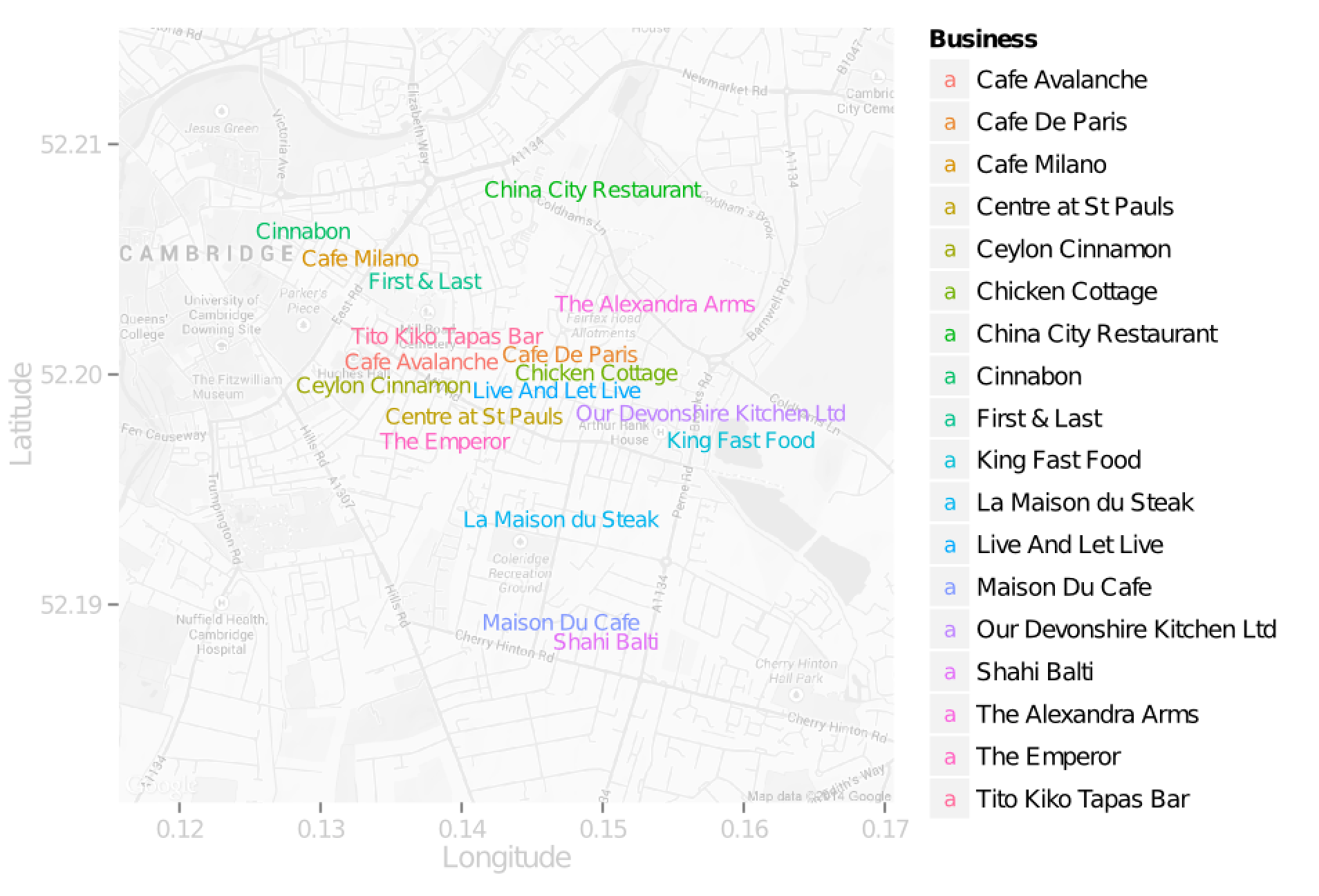
cam_restaurants <- read.csv("cam_restaurants.csv") # load dataNow places like newsagents that sell food also get rated, so I’m going to subset out just the the kinda joints I’m really interested in.
  selected<-c("Mobile caterer",
              "Pub/bar/nightclub",
              "Restaurant/Cafe/Canteen",
              "Takeaway/sandwich shop")
  cam_clip <- cam_restaurants[cam_restaurants$BusinessType %in% selected,]
I’ll also need to get three maps of Cambridge at different magnifications.
cam = get_map('Cambridge, UK',13,scale=4, color="bw")
cam_mid = get_map('Cambridge, UK',14,scale=4, color="bw")
cam_zoom = get_map('Cambridge, UK',15,scale=4, color="bw")
And the first plot - where the food selling places are, and which of the four categories they are.
pdf("cam_4.pdf")
ggmap(cam) + geom_point(data=cam_clip,
                        aes(x=Longitude,
                            y=Latitude,
                            colour=BusinessType),
                        size=2,
                        alpha=0.5,
                        shape=19)
dev.off()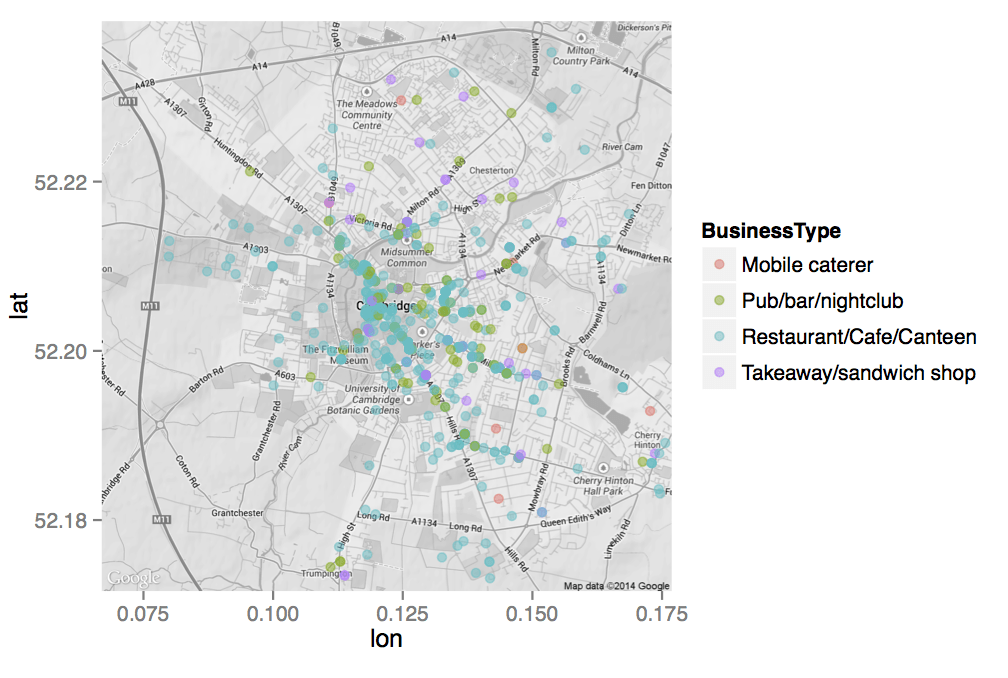
What about the food ratings? First I’ll split it into 1 & 2 (which is bad) and 3-5 (which are the ones rated the highest).
cam_cut <- cam_clip
  levels(cam_cut$RatingValue)
  combine1 <- c("1", "2")
    levels(cam_cut$RatingValue)[levels(cam_cut$RatingValue) %in% combine1] <- paste(abbreviate(combine1, 5), collapse = "&")
  combine2 <- c("2","3", "4","5","Exempt")
    levels(cam_cut$RatingValue)[levels(cam_cut$RatingValue) %in% combine2] <- paste(abbreviate(combine2, 5), collapse = "&")
And now I plot the dirty (1-2) against the clean (3-5 and exempt). If you run this code, you’ll see the extant options makes sure my contour plot isn’t constrained. Which also meant I had to edit this plot down after running it.
pdf("cam_dirty_points.pdf")
ggmap(cam_mid, extent = "normal", maprange=FALSE) +
  geom_density2d(data = cam_clip_dirty,
                 aes(x = Longitude,
                     y = Latitude)) +
  stat_density2d(data = cam_clip_dirty,
                 aes(x = Longitude,
                     y = Latitude,
                     fill = ..level.., alpha = ..level..),
                 size = 0.01, bins = 16, geom = 'polygon') +
  geom_point(data=cam_clip_dirty,
             aes(x=Longitude,
                 y=Latitude),
             size=1,
             color="red",
             alpha=1,
             shape=19)
dev.off()

pdf("cam_clean_points.pdf")
ggmap(cam_mid, extent = "normal", maprange=FALSE) +
  geom_density2d(data = cam_clip_clean,
                 aes(x = Longitude,
                     y = Latitude)) +
  stat_density2d(data = cam_clip_clean,
                 aes(x = Longitude,
                     y = Latitude,
                     fill = ..level.., alpha = ..level..),
                 size = 0.01, bins = 16, geom = 'polygon') +
  geom_point(data=cam_clip_clean,
             aes(x=Longitude,
                 y=Latitude),
             color="red",
             alpha=1,
             shape=19,
             size=1)
dev.off()
And a gif going from 1 (bad) to 5 (great). No code, as gifs from R requires installing external programs via the terminal. This makes it more clear that it’s not just ‘the dodgy places are in Mill Rd’, as the 4 star rated places are also clustered towards Mill Rd. It’s mainly just but it looks like the very worst rated places are out towards Mill Rd, while the 5 star rated places are clustered back towards the centre.
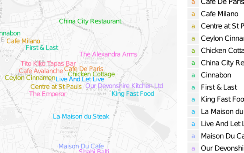
So most of the restaurants with poor food safety ratings are around mill road. So what are the called?1 The following code will plot their names, zooming in on Mill Road. I manually moved the labels around to make them readable. So it’s just the rough location.
cam_clip_dirty_1$Business <- as.character(cam_clip_dirty_1$BusinessName) # change format for plotting
cam_clip_dirty_1 <- cam_clip[cam_clip$RatingValue %in% "1",] # clip to dirty
cam_mill = get_map('Mill Rd, Cambridge, UK',14,scale=4, color="bw") # focus on mill road
p <- ggmap(cam_mill)
p <- p + xlab("Longitude")+ylab("Latitude")
p <- p + geom_text(data = cam_clip_dirty_1,
                   aes(x = Longitude,
                       y = Latitude,
                       label = Business,
                       color=Business
                       ),
                   size = 3, vjust = 0, hjust = -0.5)
p
ggsave("dodgey_name.pdf")I should add this was their status on the 20th of Feb 2014, they may of redeemed themselves since! I know a favourite curry house of many Jesuans, was also responsible for a major food poisoning outbreak. So these poor ratings are hopefully transient. ↩︎
James Black
PhD (Cantab)
James Black. Kiwi | Epidemiologist | Data Scientist | Engineering enthusiast.