Plotting data from the ski tracks app in R
Plotting data from the ski tracks app using R, from a recent trip to Pitztal Glacier.
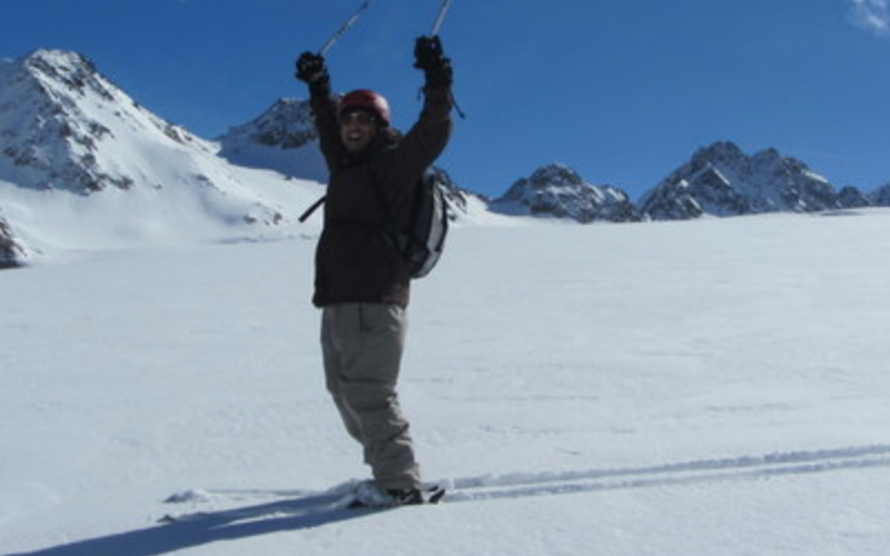
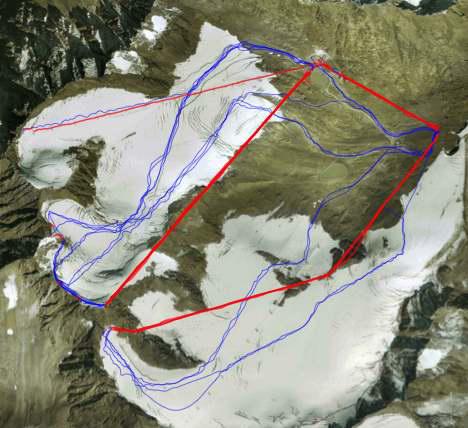
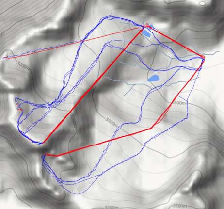
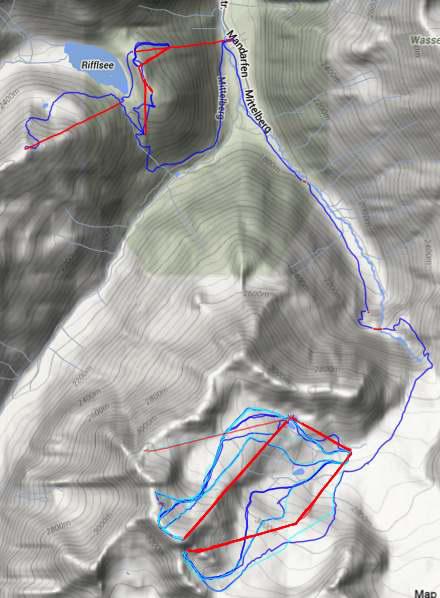
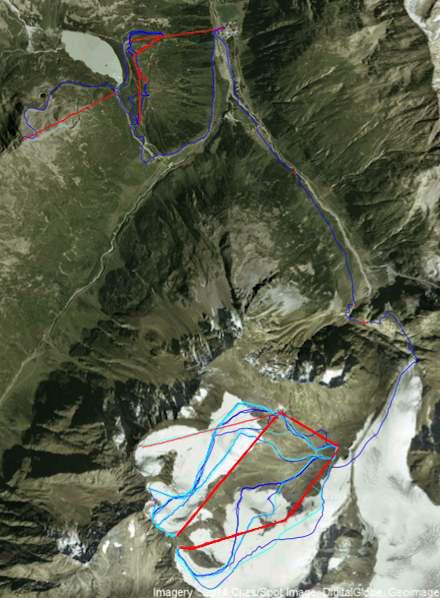
A week ago Tina and I went skiing at an Austrian resort called Pitztal. While it’s a pretty small ski field by European standards1, Pitztal sits on the highest glacier in Tyrol, and has incredible snow. Below is a map. We mainly skied on the Pitztal Glacier, and only really went across to Rifflsee for the last few runs of the day.

While there I used an app called Ski Tracks to record where, when and how fast I skied.
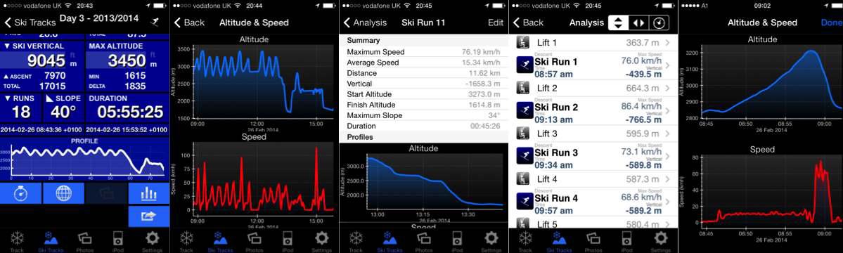
The app actually makes really great graphics, and if you’re not an R fanatic there really isn’t a need to pull out the data and re-plot it yourself. Below are some example screens from within the app.
Get the data into R
I like the freedom to do what ever I want with the data though, so I pulled it into R. There are ready made functions out there to read a gpx file into a data frame2, or you can use an online service to convert it to a csv.3
Define run direction
As you ski down the hill, and ride a gondola up it, it should be easy to code if you are actually skiing.
# code if going up or down!
  updown <- sapply(1:nrow(routes
                                 ),
                          function(i) (
                            ifelse((routes[i,"elevation"] - routes[i-1,"elevation"])>0,"Up","Down")))
Unfortunately you do go up and down during a run, so I had to do some manual edits after.
Day one skiing
Below is day one of skiing. The code for this plot is here.
Day one, two and three skiing
At Pitztal, you take an underground train from the village up to the glacier. On the second day we found out it is possible to ski down from the Glacier, all the way through the town, to the gondola that goes up to the other part of the ski field called Rifflsee. This was my favourite run on the mountain, as the one run was a vertical drop from 3,440m to 1,674m.4 Meaning you start a couple of hundred metres below the height of Mt Cook (NZ’s biggest mountain), and ski a vertical distance that’s bigger than the distance between the top of Coronet Peak ski field, and sea level.
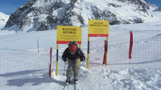
The best bit of the run that goes between the ski areas was you have to ski through the gate below at the start of the trail.
The photo’s below show day one and three overlaid. The blue line linking the two ski fields is the epic run mentioned above.
According to Ski Tracks, my top speed was over 110 km/hr. Looking at the raw data, there was one part of the run where I was at mid-80’s, before suddenly it jumped up 20 km/hr for 3 data points (which was about a second). This is just phone GPS data, and probably full of errors, so I manually subtracted the bonus 20 from those three data points.
In general the Ski Tracks app seems to do some sneaky smoothing when it plots the data in-app. The raw data seems to have bigger variations. For one sequence of three data points, my phone claims I went from 76 km/hr to 85 km/hr to 71 km/hr. In just under a second. Because of this, coupled with the implausible 120 km/hr speed burst, I decided I should chuck a rolling average over my speed data.
map_data_2_trunc <- map_data_2[
  map_data_2$index %in% names(which(table(map_data_2$index) > 10)),
  ] # make a subset of data with just runs over 10 data points (i.e. at least a minute long).

library(zoo) # zoo has the rollmean function
index <- unique(map_data_2_trunc$index) # only do rolling average within a run
for(i in index){
  map_data_2_trunc[
    which(map_data_2_trunc$index==i),c("speed_roll")
    ] <- rollmean(map_data_2_trunc[
    which(map_data_2_trunc$index==i),c("speed")
    ],5, fill=NA) # Average over 5 points. Note, as at the start of a run you cant
    #				 have a rolling average, so some data points are lost,
    #                and become NA.
}
Now plotting the runs, colouring by the rolling average speed.
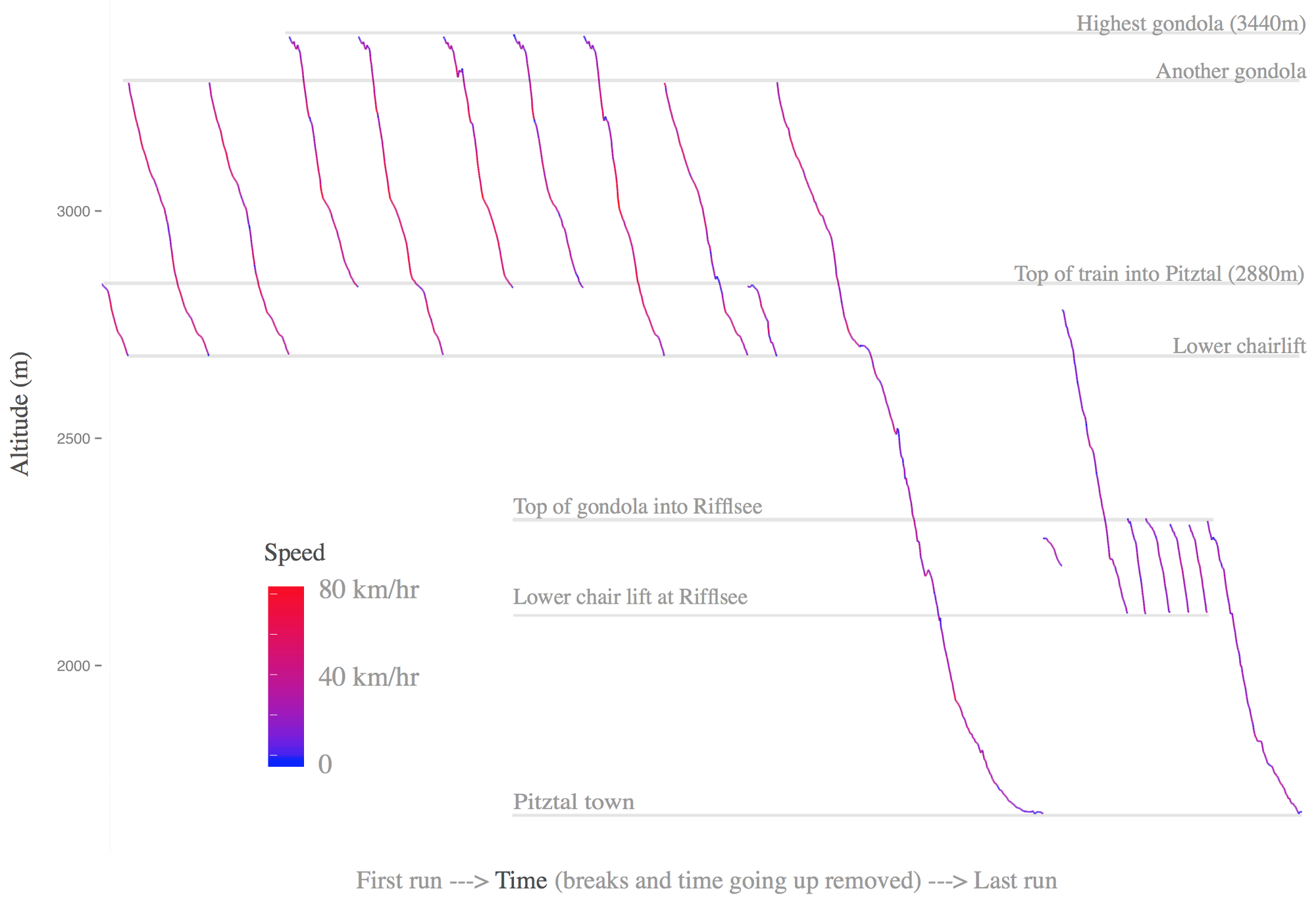
The data seemed to be the most unreliable for a handful of the runs. In the next dotplot I tightened up the code to drop any runs with less than 100 data points, and increased the rolling average to to cover about a 30 seconds of data. I liked how the bits of the run where I usually slow down start to show up.
Code for the dotplot is here.

Finally, a 3D scatter plot of the runs from day two. The 3D scatter plot is super simple to make: code is here.

Pitztal has 40.6 km of runs accross Rifflsee and the Glacier. Arlberg, Kaprun, SkiWelt and Ischgil are all Austrian ski fields with more than 220km of piste. ↩︎
An example of a free service is GPS visualiser ↩︎
If you started at the top of the highest gondola at Pitztal. ↩︎
James Black
PhD (Cantab)
James Black. Kiwi | Epidemiologist | Data Scientist | Engineering enthusiast.