Simpson's paradox in diabetes
Using the D3 javascript library to visualise Simpson’s paradox.
Definition
For the month of July (2014) I’ll be teaching medical science for a summer school in my college. Over the last week I’ve started to put together the slides I’ll be using. To help explain the concept of Simpson’s paradox I played around with rejigging somebody else’s code to fit the context of diabetes (my research area). The code used to make the plots below was originally written by the Vudlab at UC Berkeley.
I’ll let wikipedia give an introduction to the Simpson’s paradox,
Simpson’s paradox, or the Yule–Simpson effect, is a paradox in which a trend that appears in different groups of data disappears when these groups are combined, and the reverse trend appears for the aggregate data.
Example
David Spiegelhalter, an academic who’s work I admire, contributed ideas to a paper on Simpson’s paradox that was published in the BMJ.1 One of the examples used in the paper was from the Poole diabetes cohort. The researchers broke a group of people with diabetes into two groups. One required insulin (usually type 1 diabetes), the other sub-group didn’t (type 2 diabetes).
They followed the two groups, and found that those with insulin dependent diabetes were 31% less likely (95%CI 46% to 13%) to have died during the follow up. Yet when the adjusted for age, the association flipped and those with insulin dependent diabetes were 15% more likely to have died (statistically non-significant, 95%CI -9% to 46%).
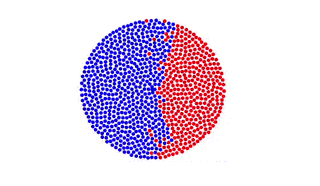
The population
Below, each dot represents an individual from the study. Red have insulin dependent diabetes. Blue have non-insulin dependent diabetes.
Insulin dependent diabetes
In the next plot is just the people with insulin dependent diabetes. In this group 29% of people died (those that died are the red dots).
Non-insulin dependent diabetes
And in the next plot is the people with non-insulin dependent diabetes. In this group 40% died during follow up. So it looks like people are more likely to die with non-insulin dependent diabetes! This really doesn’t make sense, as insulin dependent diabetes is usually assumed to be a more serious manifestation of the disease (insulin is a last resort in type 2 diabetes).
Interactive example
The last plot below shows how the variable age helps explain what is happening. Hitting the green button will make the individuals move between groups.
This paradox occurs because people are more more likely to get type 2 diabetes later in life. People are also more likely to die later in in life. So not accounting for the age difference in the people with the two conditions means you can come to the wrong conclusions.
I’m planning on including these plots in my slides (the joy of HTML5 slides is being able to to bring in amazing plot libraries like D3).
BMJ 1994;309:1480 ↩︎
James Black
PhD (Cantab)
James Black. Kiwi | Epidemiologist | Data Scientist | Engineering enthusiast.