Changing fate of the German football team
Looking at how FiveThirtyEights predictions for the world cup winner changed.
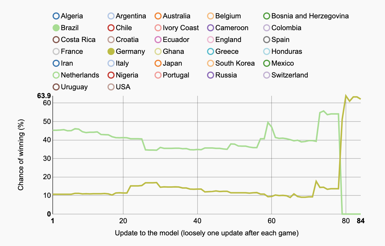
As the final game of the World Cup started, Germany had gone from outsiders to the team expected to win, while Brazil had fallen in disgrace from firm favourites to 4th place.
FiveThirtyEight released updated predictions on who would win the World Cup at the end of each game. When I saw they had the raw data of their game by game predictions, I figured it would be cool to plot the changes in each teams predicted chance of winning over time.
During the competition;
- Germany peaked with a 64% chance of winning on the day of the final
- Brazil peaked with a 56% chance of winning, in the days leading up to their 7:1 loss to Germany.
Below is a chart I made from the FiveThirtyEight data. I’ve pre-selected Germany and Brazil, but by clicking the circles above the plot you can see all 32 teams changing fortunes.
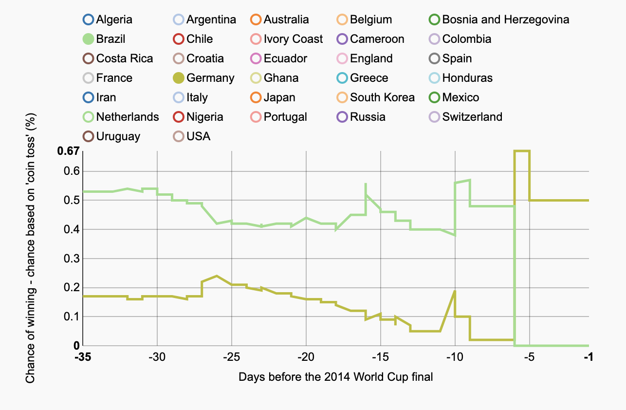
Mark made a comment saying that as time went by, teams are expected to be more likely to win just by surviving. This because the odds should add up to one (assuming the prediction model relies on this assumption..). In the plot below the chance of winning if it was allocated purely randomly has been subtracted from the predicted chance of winning from the model. I’ve highlighted Costa Rica’s results here, as they had a great run, before succumbing to the fact that the teams left to beat were out of their class.
As you can tell from above, occasionally FiveThirtyEight updated their predictions more than once during a day. Usually this was because of multiple games taking place, and odds would change with each result. Mark made a few comments below, the first being what would the plot look like based on the release of new information (scores from a game) being the x axis. Below is a plot where I’ve followed his suggestion and used the 83 updates as the x axis.
The script I used to make this plot is at http://rpubs.com/epijim_nz/worldcup2014, and the data is is on the FiveThirtyEight repo: https://github.com/fivethirtyeight/data.
James Black
PhD (Cantab)
James Black. Kiwi | Epidemiologist | Data Scientist | Engineering enthusiast.