Facebook friend migrations
Facebook friend migrations (great circles and geocoding in R).
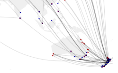
Facebook users are asked to fill in their hometown, and where they live now (although only about 60%ish of my friends actually filled this data in). This data is all up for grabs using the Facebook API, as I detailed in an earlier post. In the plot below, the blue dot is my Facebook friends hometown and the red is where they live now. I have put a black line connecting hometown to current location.
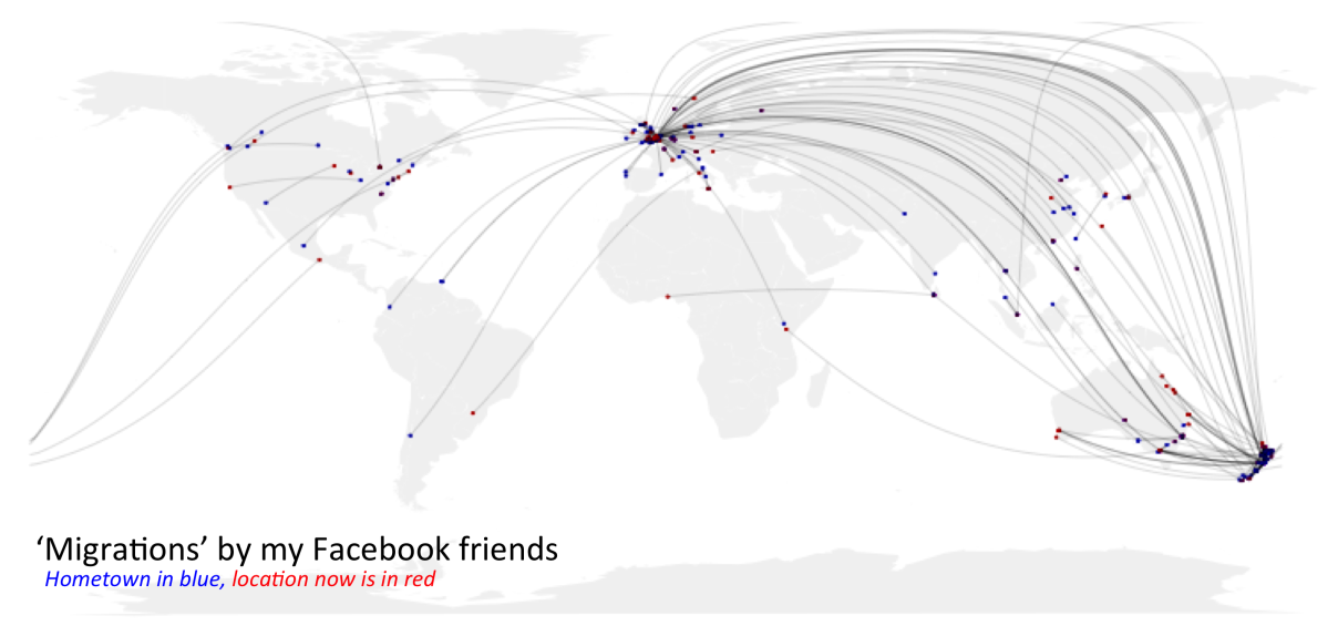
Unfortunately this map only highlights outliers – the vast majority of my friends are clustered in a few cities. I played around a bit with the transparency of the points and lines to try and get a sense of numbers involved, but this graph still doesn’t convey the fact that a big portion of my friends currently live in Cambridge, and their hometown was London, Wellington or Auckland.
Great circles
The lines connecting hometown to current location are drawn as ‘great circles’, using the geosphere package. The site Flowing data gives a good tutorial on how to use the package. One thing it doesn’t help with though, is what to do when a connecting line crosses the international dateline. The problem is that the command spits out a matrix giving the path between two points, but if someone crosses the date line it spits out a list of two matrices. One matrix for each side of the datelie.
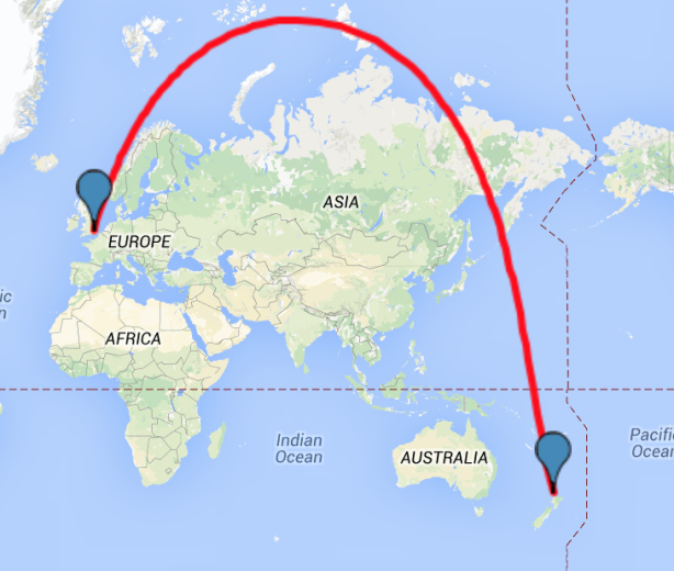
The plot above also suggests the fastest way between London and New Zealand is by skirting the North Pole. This surprised me – so in case you don’t believe the plot above, the picture below is a screenshot of the shortest distance between Auckland and London, according to the website Maptools.
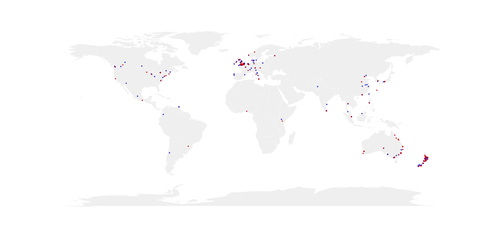
Just the locations
Here’s the plot again without the lines. I think my next plan is to find a way to plot the latitude and longitudes into a country level chloropleth. I played around with hexbinning, but the data is too clumped for that style of plot.
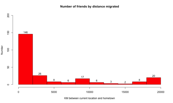
Flying the nest
I was pretty surprised by the spread of my friends migrations. A lot more than I thought were still within a few thousand KMs of their hometown. As not all my friends filled in the hometown and current location fields in Facebook, I’m assuming there is a bias where the friends that migrate are also less likely to share their data on Facebook.
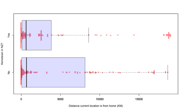
Kiwi migrations
With the caveat that the data has holes, and as it is just my Facebook friends is completely unrepresentative, the plot below (raw data points in red over a box plot) separates my friends into those with a hometown in NZ, and those with a hometown anywhere else. You can see the clusters of Kiwis that have moved to Melbourne, and the cluster in Europe.
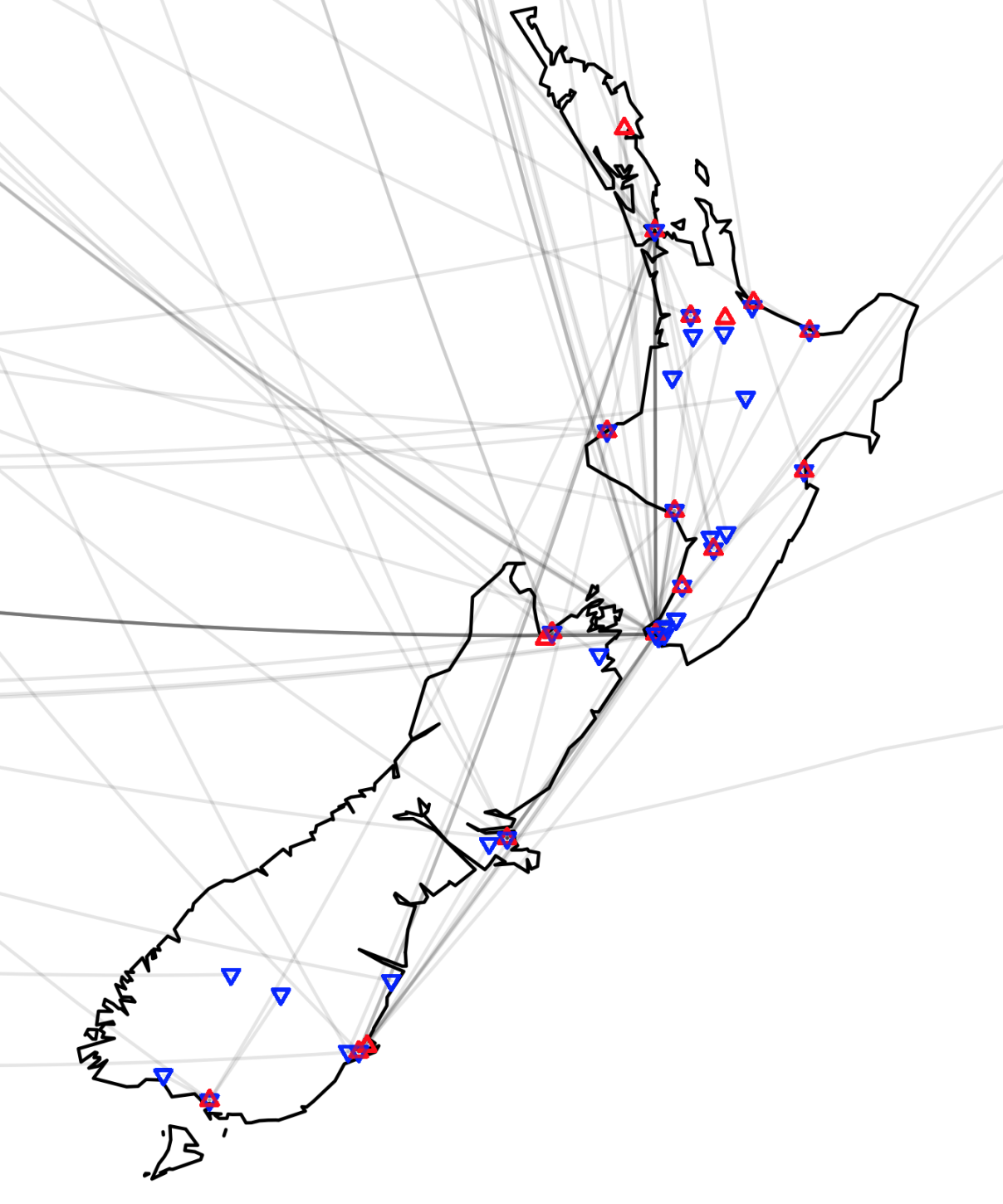
This last plot is zoomed into New Zealand.
James Black
PhD (Cantab)
James Black. Kiwi | Epidemiologist | Data Scientist | Engineering enthusiast.