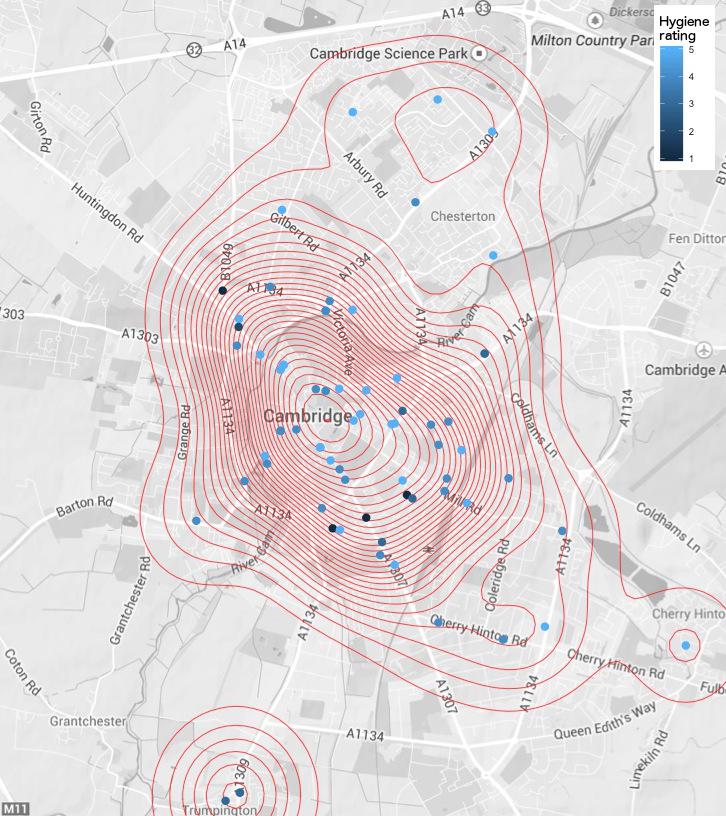
Distance to the nearest pub
Building a matrix of the distance to the nearest pub using FSA and google data.
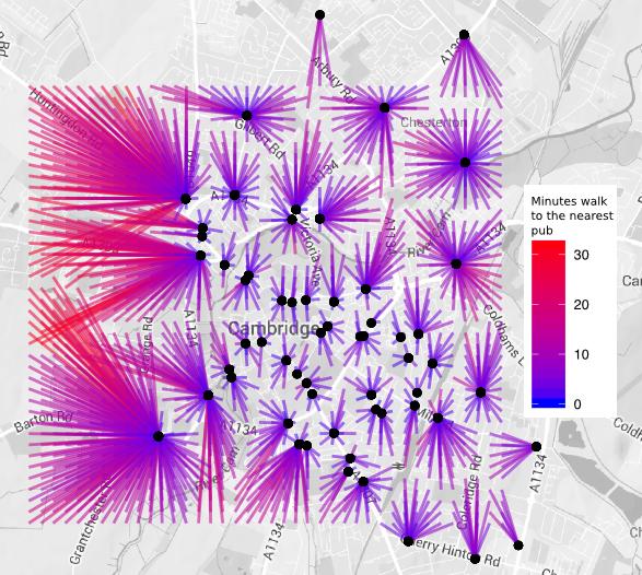
The plot below shows the distance to the nearest pub, from a grid of
spots in Cambridge. Starting in the top left of the green box, I ran a script that calls
the Google Distance Matrix API to ask where the nearest pub is. It then moves a little to the right,
and asks again. When it hits the far side of the box, it drops down and
makes a new row of calls. Distances are coloured based on the time Google says it will take
to walk from that spot to the pub. I originally made this plot last year using Google’s data on Cambridge pubs,
but the data Google has is very inaccurate. The Food Standards Agency though has a daily
updated XML file, which has every pub nicely geo-coded.
This updated plot should be far more accurate.
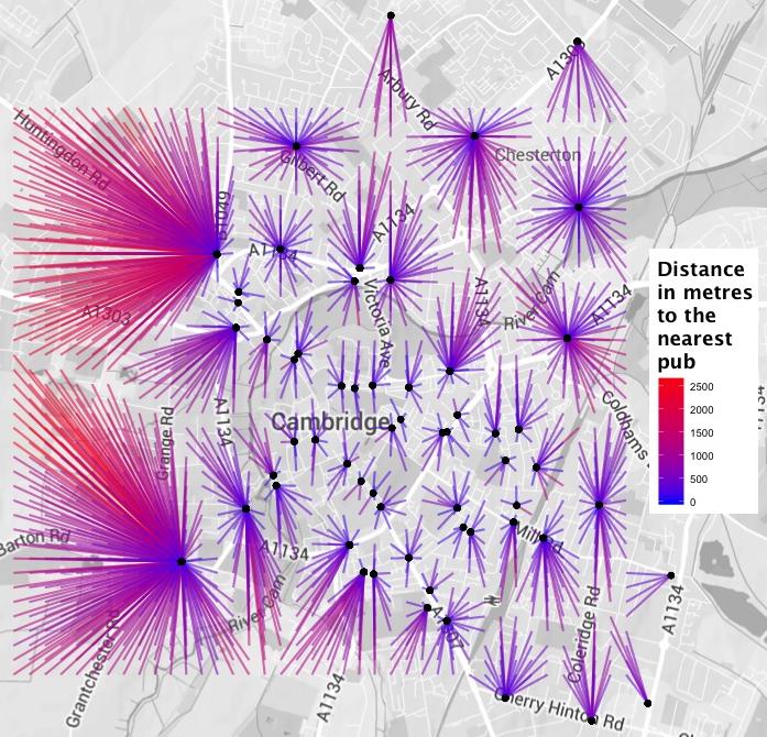
The plot
The old plot
Google only allows 2,500 calls to the distance API a day, and there are 1,600 points in my grid. This means it would take days to find out the walking distance to every pub. When I first made this plot I simply went with the closest pub as the crow flies. When updating, I decided to look at the walking distance to the two closest pubs. The plot below is using the method from my old post, where I assumed the closest in a straight line was also the closest when walking.
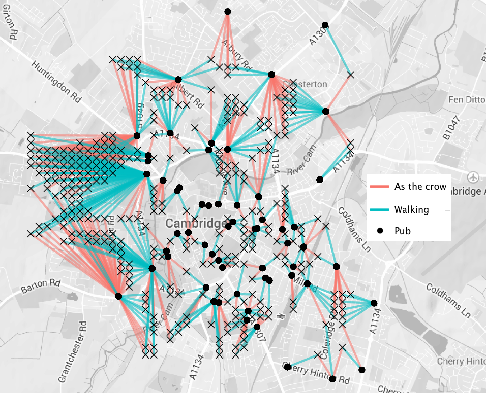
Where I went wrong
While the difference between the two plots above are a little hard to make out, the plot below shows all the points in my grid where the shortest as the crow flies is not the shortest when walking. I made this post in one day, and only had access to three API keys (I maxed out my own, Tina’s and the college IP address for day). This meant I could only check the three closest pubs in a straight line. I’m fairly confident the 316 (20%) points I found where the closest in a straight line, and walking, is different, covers all of the cases. The only potential problem is that shortcuts through colleges and greens aren’t currently accounted for. The plot below shows where the first post I made of distance to the nearest pub was wrong.
Pub dense areas
The following plot simply shows where the nearest pub is.
How to
Nathan Yau wrote a brilliant book called Datapoints1, where he introduces this style of map, and it is from there that based the code to handle the geo-coding.
Below are links to some snippets I used to make this plot
Nathan Yau (2013) Data Points: Visualization That Means Something, ISBN: 978-1-118-46219-5 ↩︎
James Black
PhD (Cantab)
James Black. Kiwi | Epidemiologist | Data Scientist | Engineering enthusiast.