Contour mapping Cambridge crime
Plotting Cambridge crime data on a map using R.
The Cambridge Constabulary has location data on just over 280,000 crimes that have happened between December 2010 and October 2013. It’s just too great of a dataset not to take a look…
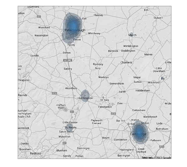
Not surprisingly, the majority of crimes take place where the people are. So what about in Cambridge?
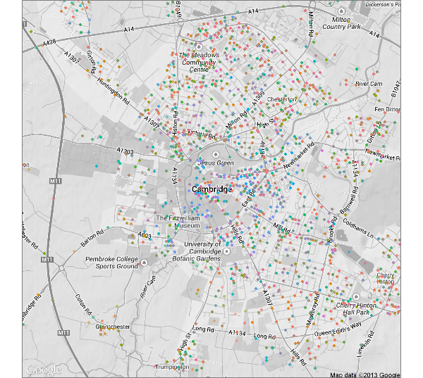
Each point below is a crime, and they are coded by the 16 types of crime that the police have pre-categorised. I didn’t bother with a key, as 16 is just too much to get my head around at once.
Below is the same map, focusing on the four types of crimes that looked interesting to me.
- Antisocial behavior (I’m going to call them ASBOs, although really they are incidents not convictions or actual orders)
- Burglaries
- Drug related arrests
- Bicycle thefts
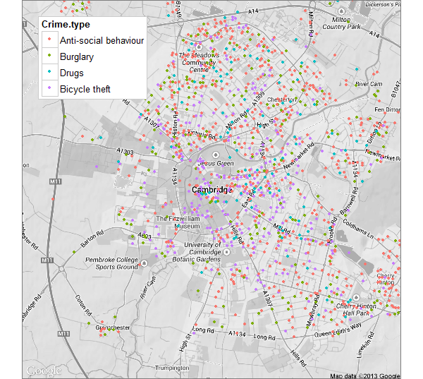
While it’s possible to see a possible clustering of bicycle thefts in the centre of town, and (not suprisingly) most burglaries seem to take place out of the centre, it’s still hard to make out any patterns.
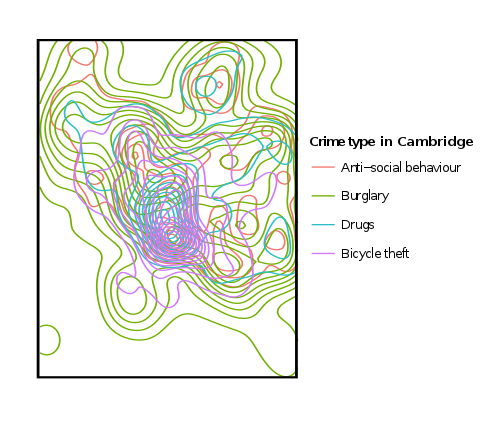
So is there really difference on where the crimes happen? Overlying the four types gets really messy. Below is the same four crime types overlaid. I removed the map entirely as it’s already so cluttered, and I was mainly interested in how they overlapped.
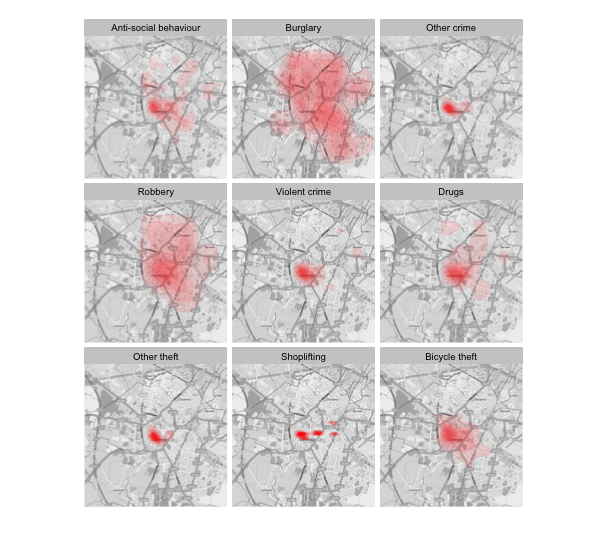
Below is a density map of the 9 most common crimes. Shoplifting seems to be focused on the shopping malls, burglaries have a pretty decent spread. Interestingly, there isn’t many bikes stolen from West Cambridge.
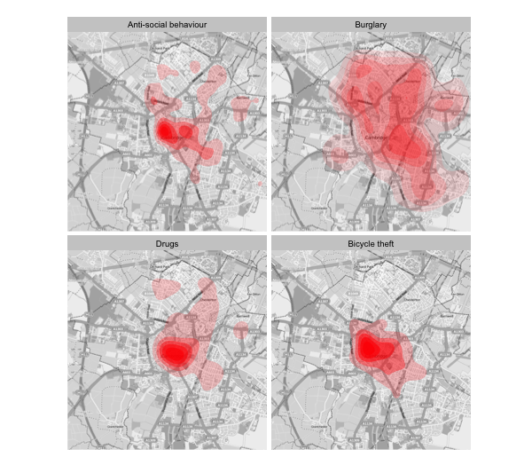
Looking at the four most interesting (to me) in detail, below.
Over the last 2 years, and within the bounds of my Cambridge maps, there were:
- 16,534 ASBOs
- 2535 burglaries
- 1502 drug related incidents
- 1100 bicycle thefts
Before I can use these plots I need to work out how to set the density scale as constant. The scales of a density plot, at least to me, are pretty random (it went up to 2,200) for the plots above. As far as I can tell from the documentation, in the plot above, it’s a common scale across each panel of the plot, but if you look at the numbers, that doesn’t seem to be the case.
Below is the four plots individually, where the density limits vary. Definitely something I need to figure out before using these plots for real.

Below is the script to load up the csv’s, as you get them from the police website.
setwd("Directoy where the data is saved")

library(plyr) # used to read in csvs
library(psych) # has the describe function

################
# import data  #
################

# Data is in monthly CSV's, so loop over them pulling in data

  # CAREFUL this will get all .csv names in directory
  temp_filenames = list.files(pattern="*.csv")

  #Now we have a list of the csv names, read them into one data frame
  crime_data <- ldply(temp_filenames, read.csv)
  #could do in full like below, but prefer the shorter method above using plyr
  #crime_data <- do.call("rbind", lapply(temp, read.csv, header = TRUE))

# take a gander!
  head(crime_data)
  summary(crime_data)
  describe(crime_data)
  str(crime_data)
  # so 228, 949 crimes are in the database,
  # seems most the crime ID stuff came in later, and ties into the seperate
  # outcome data. Same with context. For now I'll focus on location,
  # time and type of crime

  #DATA ISSUES. Time is a factor variable.
And now plot it.
  theme_bare <- theme(axis.line = element_blank(),
                      axis.text.x = element_blank(),
                      axis.text.y = element_blank(),
                      axis.ticks = element_blank(),
                      axis.title.x = element_blank(),
                      axis.title.y = element_blank(),
                      legend.position = "none")

cambridge <- get_map(location="Cambridge, UK", zoom=13, color="bw", source="osm")

CambridgeMap <- ggmap(cambridge, baselayer = ggplot(aes(x=Longitude, y=Latitude),
                                                    data=crime_data))

CambridgeMap + stat_density2d(aes( x=Longitude,y=Latitude,
                                   fill=..level.. , alpha=..level.. ),
                              data=crime_data, bins=6 ,geom = "polygon" ) +
                              scale_fill_gradient(low = "red", high = "red") +
facet_wrap(~ Crime.type) + theme_bareJames Black
PhD (Cantab)
James Black. Kiwi | Epidemiologist | Data Scientist | Engineering enthusiast.