When is it nice in Cambridge?
Plotting when the weather is nice in Cambridge.
As winter descends on Cambridge (it’s currently 8°C), I wondered if winter started this early last year. Earlier this year I came across a post where someone had plotted where in America the weather was most consistently nice.1 As part of the course I’m doing at the moment, I came across a script to call Weather Underground for historical weather data.2 Coupling this with R’s ability to plot calendar maps3, it’s easy to visualise when it’s nice year to year.
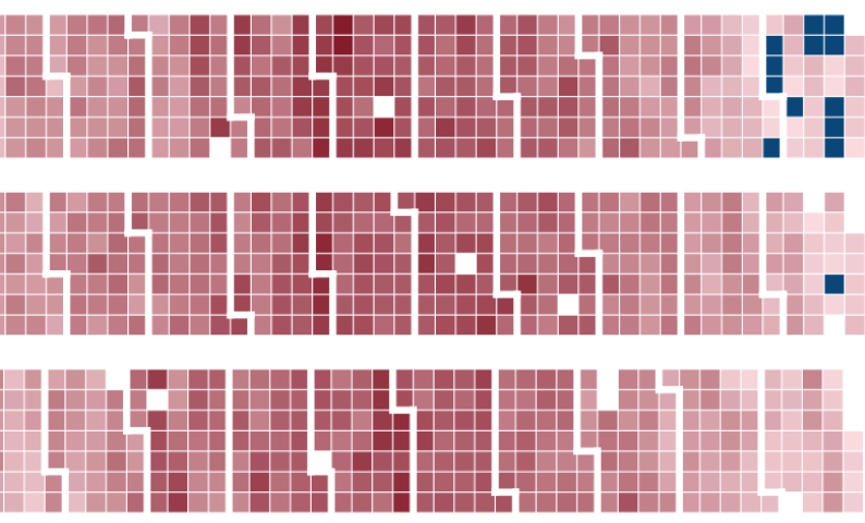
An example calendar map
Below is an example of a calendar map produced in R. The API seems to consistently give missing values on the same days, a few times a year, so please excuse the white spaces. I think the problem is with the Weather Underground data, as there are weird patterns to the missing data if you compare the API to the point and click historical values. For instance, lots of the days missing when using the API have a high of exactly 6.1°C when looking at the weather history via a browser. I was also more interested in general patterns, so I left the scale off these plots.
What is ‘nice’
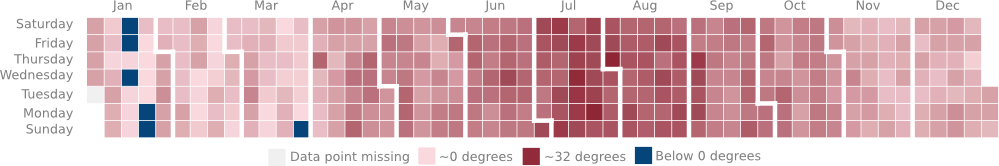
In the next plot I’ve tried to categorize days into nice days (in green), rainy days (in blue) and other days in grey. Specifically:
- Green squares are days when the days maximum temperature was between 15 and 30°C and it did not rain
- Blue squares are days with more than 1mm of rain
- Grey squares are days that were too hot or too cold (and free of rain)
- A few squares are white due to missing data
When it’s nice in Cambridge
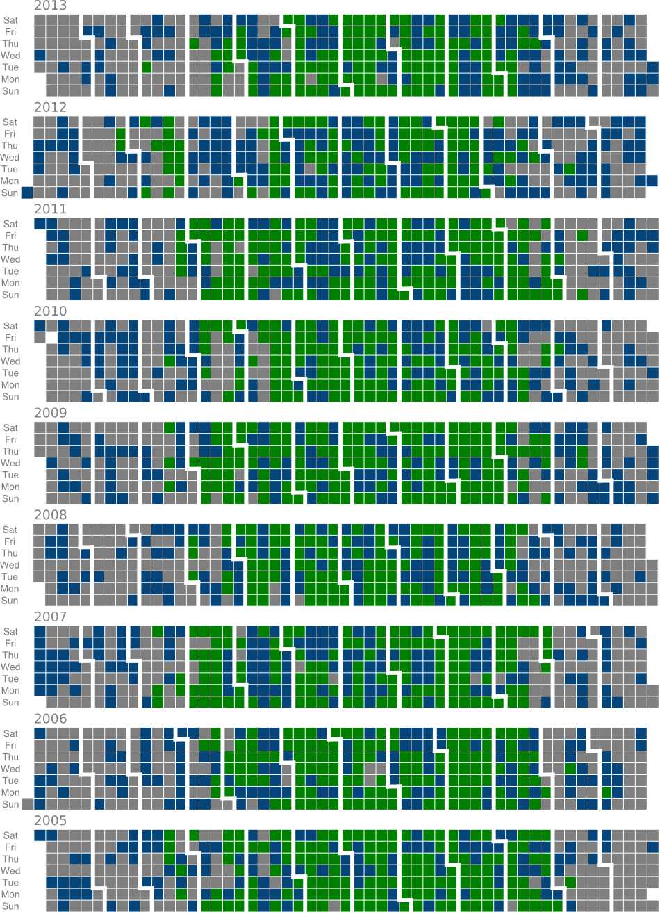
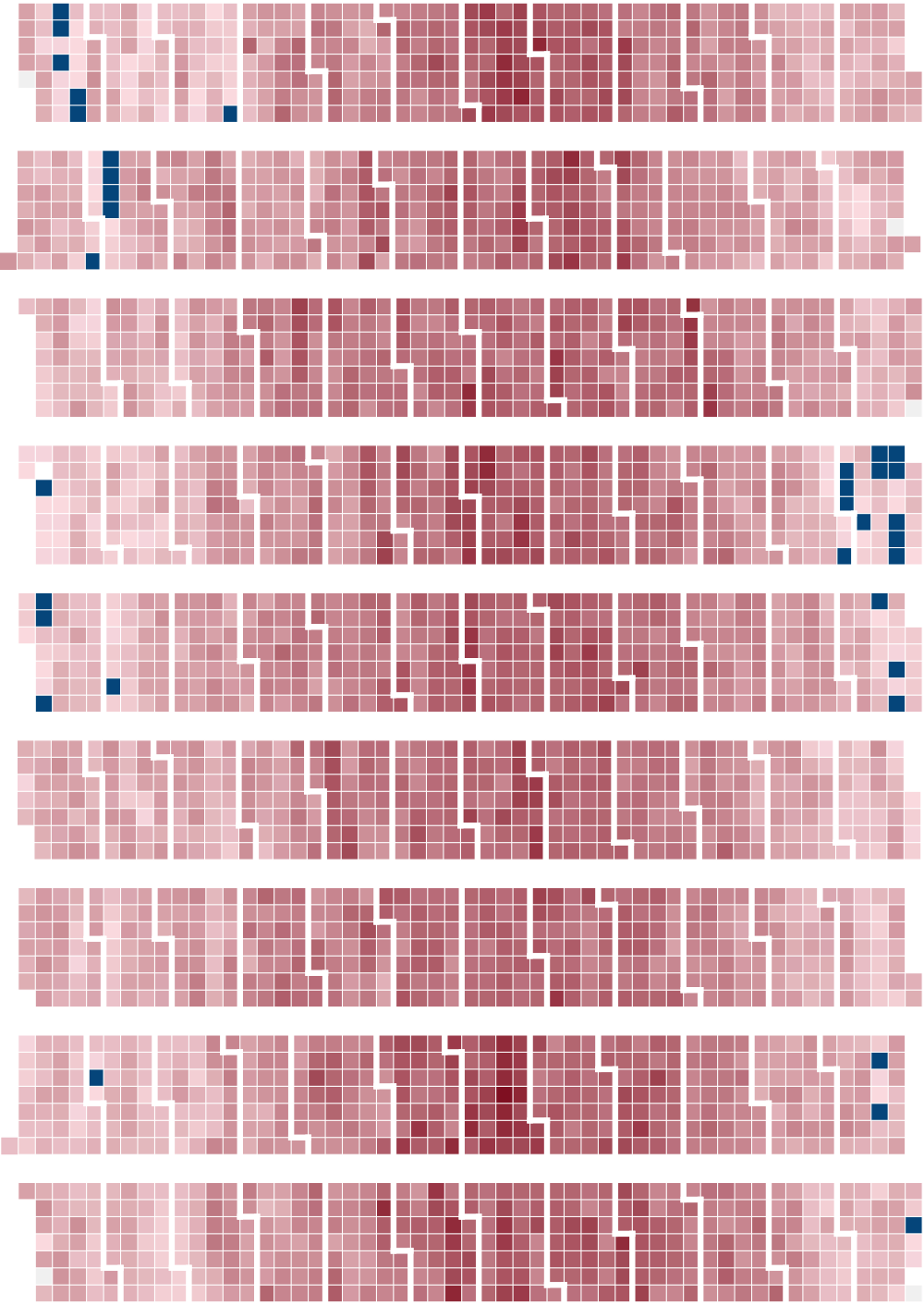
So by the looks of things, June-September is fairly consistently when the nice weather is, and the rain seems to be fairly evenly distributed. In the next plot, I’ve coded temperatures like in the first figure. Light red is around zero, darkest red is getting towards 32C. Blue is any day with a high below 0C.
I’ll add a link when I find the original again. ↩︎
The Weather Underground script is here: http://allthingsr.blogspot.co.uk/2012/04/getting-historical-weather-data-in-r.html ↩︎
There are multiple options for plotting calendar maps in R.
gvisCalendarfrom thegoogleVispackage, or Nathan Yau’s custom script are two examples. ↩︎
James Black
PhD (Cantab)
James Black. Kiwi | Epidemiologist | Data Scientist | Engineering enthusiast.