My PhD in numbers
A number based breakdown of my PhD.
A PhD in numbers
After a three year slog, yesterday I got the green light to submit my PhD. I versioned controlled the document from the day I started using git, and since all that data was sitting there as a log of my PhD journey, I decided to take a look at it.
There were 860 days between starting to write my thesis and the final confirmation from my examiner I could submit. Overall, I made commits (which is basically when I saved changes) to the thesis for 99 of those 860 days (12%). In more conventional metrics, I wrote a total of 48,622 words, and sourced 22 different files into the final compiled PDF of my thesis.
In git, I usually create a commit each time I finish working on a particular module of my code. I took quite a different approach in my thesis though, as I only pushed a commit each time I finished a session of working on the thesis. So, based off my commits, I sat down to work on the thesis 305 times, which was 0.4 times a day on average from the day I started.
Looking at just the days since I started (or more accurately, ran init git) the git log of the repository for my thesis doesn’t represent when I was working on it, as there were 118 days between submitting the thesis to my examiners and getting the go ahead to ahead to submit. So a more accurate picture of the writing process is to look at the 1,027 days between my matriculation as a new PhD student, and submission. Using this period, I worked on the actual text of my PhD, on average, 0.3 times a day.
Below I’m limited to data pulled from my
.gitfiles. An important caveat is that commits do not represent the quantity of changes that were made, as sometimes I would be adding a sentence to reference a new paper, and other times I would be wrapping up hours of solid writing. On top of this, a picture, literally, adds thousands of lines to the codebase of the thesis. So using lines of code as a metric is really about when figures were added.
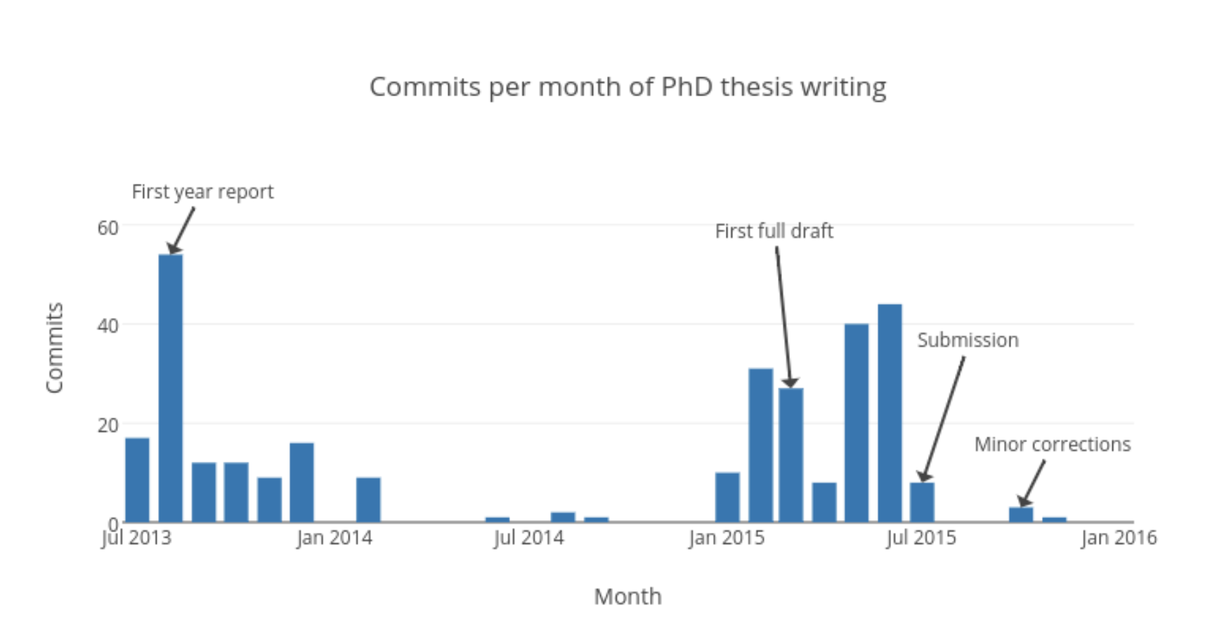
Commits per month
The following plot shows the monthly count of commits I made to my thesis. It emphasises how my thesis was essentially written in two enthusiastic sprints.
- One in my first year when I wrote my first year report, which became my first four chapters
- The second in 2015, as I tried to submit before the three year deadline and Tina and I left Cambridge for new adventures.
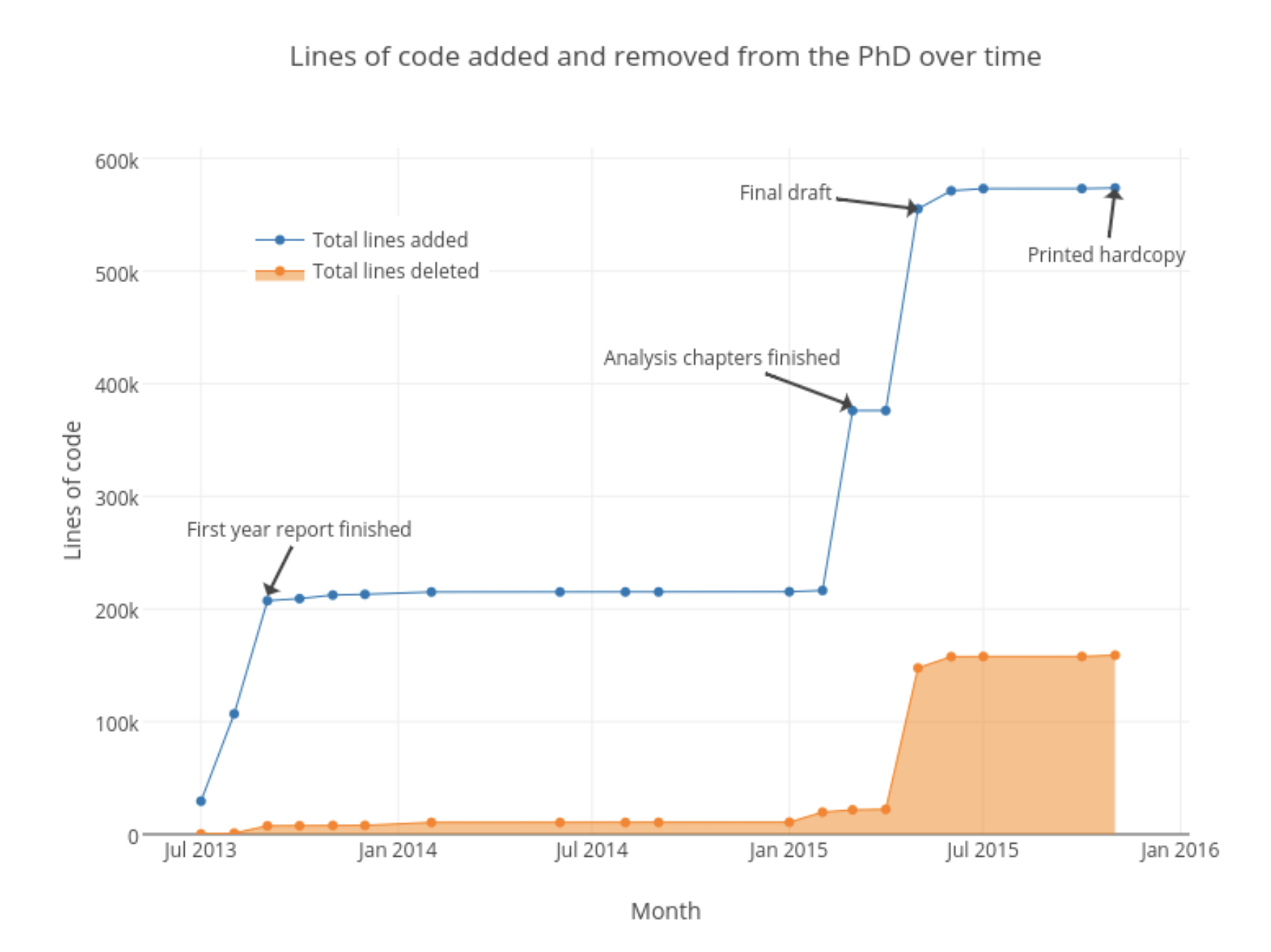
Quantity of code
Another way to look at the growth of the PhD is by the total lines of code that were required to compile it from a LaTeX document to a PDF. The plot below shows the total number of lines as the PhD grew, and the total number of lines that were deleted. This plot is slightly misleading though, as the biggest driver were the thousands of lines of code required to render the figures (which were primarily SVG and EPS). The tex files that held all the words that made up my thesis were only 4,484 lines of code, while the sty (style) file that made it look pretty was 878 lines.
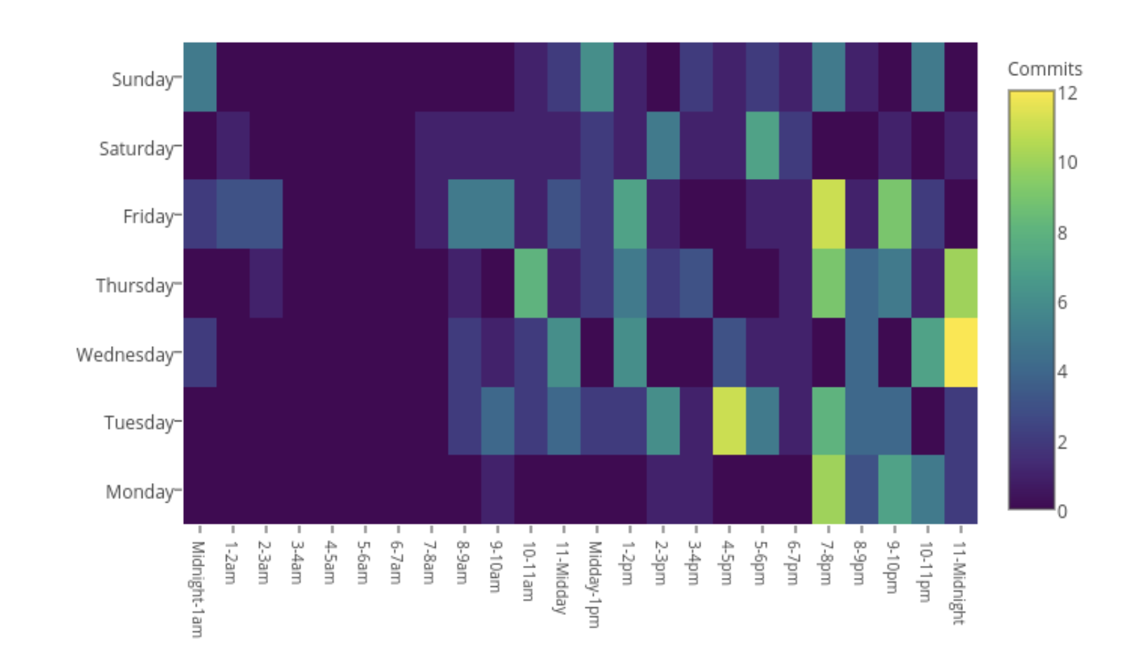
When I worked
A slightly more telling plot of my life as a student is the following heatmap of when I made commits. There were a few late nights, that tended to be later in the week, while during working hours on a Monday I seemed to avoid working on my PhD to a greater degree than the weekend.
How I got the data
I used GitStats, which requires Python and Gnuplot to be installed.
Once downloaded, cd to the folder that has Gitstats, and then tell it where your repo is1, and where you want the output. Then run the file, for example:
./gitstats /Users/Jimmy/PhD/Thesis /Users/Jimmy/PhD/ThesisQuantifiedThe plots are all R plots hosted online via the plotly API. It’s slightly redundant to post the code, as you can see the underlying code to plotly hosted plots by clicking on them, but example code for the lines of code plot is below.
mydata <- readRDS("phd_time.rds")

mydata <- mydata %>%
  mutate(
    runningadded = rev(cumsum(rev(Added))), # rev as date factor in wrong order
    runningremoved = rev(cumsum(rev(Removed))),
    runningtotal = runningadded - runningremoved
  )

myplotly <- plot_ly(mydata,
                    x = Month, y = runningtotal,
                    name="Lines added")

a <- list()
a[[1]] <- list(
  x = "2013-09",
  y = 212000,
  text = "First year report finished",
  xref = "x",
  yref = "y",
  showarrow = TRUE,
  ax = 20,
  ay = -40
)
a[[2]] <- list(
  x = "2015-03",
  y = 380000,
  text = "Analysis chapters finished",
  xref = "x",
  yref = "y",
  showarrow = TRUE,
  ax = -80,
  ay = -30
)
a[[3]] <- list(
  x = "2015-05",
  y = 555000,
  text = "Final draft",
  xref = "x",
  yref = "y",
  showarrow = TRUE,
  ax = -80,
  ay = -10
)
a[[4]] <- list(
  x = "2015-11",
  y = 573000,
  text = "Printed hardcopy",
  xref = "x",
  yref = "y",
  showarrow = TRUE,
  ax = -5,
  ay = 40
)

myplotly <-  myplotly %>%
  layout(title = "Lines of code added and removed from the PhD over time") %>%
  add_trace(x = Month, y = runningremoved, fill = "tozeroy",
            name = "Lines deleted") %>%
  layout(annotations = a,
         legend = list(x = 0.1, y = 0.9),
         axis =
           list(title = "")
         )

plotly_POST(myplotly,
            filename = "r-docs/phd_linesbymonth",
            world_readable=TRUE)
This is all done locally, although services like Github have great API’s to get statistics. ↩︎
James Black
PhD (Cantab)
James Black. Kiwi | Epidemiologist | Data Scientist | Engineering enthusiast.