Is the weather nicer in Basel, Wellington, Dunedin or Cambridge?
Comparing historical weather records from four cities I’ve lived in.
Over the last ten years I’ve lived in five cities:
- Wellington, NZ
- Dunedin, NZ
- London, UK
- Cambridge, UK
- Basel, Switzerland
Soon after our recent move to Switzerland, Tina and I noticed that grey skies seem to be rare in Basel. After years of grey and drizzle laden English winters, the dry and sunny winter in Basel has been amazing. Yet we’ve only been here for a few months, meaning our impression that the weather here is better could be driven by a combination of bias against English weather, and a lucky run in Basel.
To test this out I pulled the last 14 years of weather data for Wellington, Dunedin, Cambridge and Basel (I didn’t bother with London as it’s probably similar to Cambridge).
Temperature differences
This first plot is taking the median daily high and low, firstly for each month, then for each year. Essentially I’m plotting what a typical high and low has been for each month in the last 14 years.
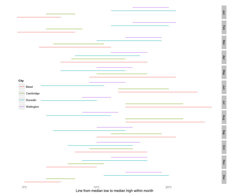
As expected - New Zealand’s seasons are reversed, but what’s also apparent is that in Europe (and Basel in particular), there is more variation in Europe. I was expecting Dunedin to be much colder, but I guess a lot of that feeling comes from it being socially acceptable to wear jandals all year, and the shoddy insulation in kiwi buildings and homes. This leaves Basel as the coldest place I’ve lived, and Wellington the warmest (on average, as the hottest days are in Basel).
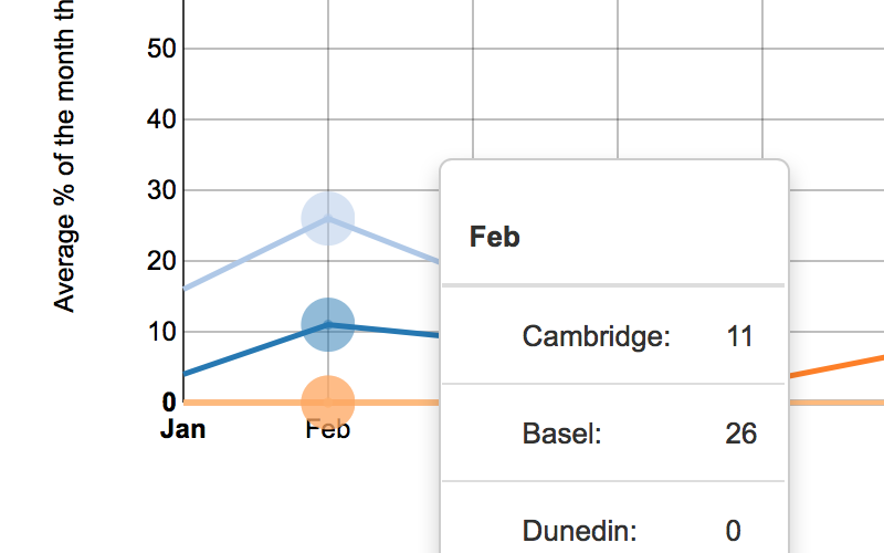
Nice days
The next question is when is… how many nice days are there? To answer, I wrote a function, the code of which is at the bottom of the page. The definition required the following:
- The high for the day had to be below 40
- The low had to be above 10
- It couldn’t rain
- There couldn’t be any hail or thunder
- Only cirrus clouds were tolerated
So in terms of ‘jandal’ safe weather, Cambridge and Wellington seem to win out. Basel unfortunately suffers from the fact that it’s winter’s are much colder (so overnight it drops below 10, my jandal safe limit). It’s a shame my data source, weather underground doesn’t have data on general greyness (the cloud type comes from airport weather data).
Snow days!
The one consolation I guess being that at least in Basel I have the hottest summers, and I can expect more snow days..
What about sunshine hours?
If I have time, plan is to wrap this in a shiny app, and to find a source for sunshine hours. Before I do that though, I want to get a shiny server going on my home server.
Nice day code definition
jb_goodday <- function(
  maxTemp=40,
  minTemp=10,
  RainTolerated=FALSE,
  FogTolerated=TRUE,
  SnowTolerated=TRUE,
  StormTolerated=FALSE,
  CloudsTolerated=FALSE,
  startYear=2001,
  endYear=2014,
  variable_toplot="goodday",
  description="good"
){
  cloudy <- ifelse(CloudsTolerated==TRUE,10,3)

  temp_data <- na.omit(weather_data) %>%
    mutate(
      Month=factor(substring(as.character(Date),6,7),
                   labels=c(
      "Jan","Feb","Mar","Apr","May","Jun","Jul","Aug",
      "Sep","Oct","Nov","Dec")),
      Date=as.character(Date),
      year=as.numeric(substring(Date,1,4)),
      tooHot=ifelse(Max_TemperatureC>maxTemp,1,0),
      tooCold=ifelse(Min_TemperatureC<minTemp,1,0),
      tooRainy=ifelse(grepl('Rain', Events),1,0),
      tooFoggy=ifelse(grepl('Fog', Events),1,0),
      tooSnowy=ifelse(grepl('Snow', Events),1,0),
      tooStormy=ifelse(grepl('Hail|Thunderstorm', Events),1,0),
      tooCloudy=ifelse(CloudCover>cloudy,1,0),
      goodday=ifelse(
        tooHot==0 & tooCold==0 &
          tooRainy==0 & tooFoggy==0 & tooSnowy==0 & tooStormy==0 &
          tooCloudy==0,
        1,0
      )) %>% as.data.frame %>%
    filter(year>=startYear,year<=endYear) %>%
    group_by(Month,icao,year) %>%
    summarise(
      tooHotDays = mean(tooHot,na.rm=T)*100,
      tooColdDays = mean(tooCold,na.rm=T)*100,
      tooRainyDays = mean(tooRainy,na.rm=T)*100,
      tooFoggyDays = mean(tooFoggy,na.rm=T)*100,
      tooSnowyDays = mean(tooSnowy,na.rm=T)*100,
      tooStormyDays = mean(tooStormy,na.rm=T)*100,
      tooCloudyDays = mean(tooCloudy,na.rm=T)*100,
      goodday= mean(goodday,na.rm=T)*100
    ) %>%
    group_by(Month,icao) %>%
    summarise(
      tooHotDays = mean(tooHotDays,na.rm=T),
      tooColdDays = mean(tooColdDays,na.rm=T),
      tooRainyDays = mean(tooRainyDays,na.rm=T),
      tooFoggyDays = mean(tooFoggyDays,na.rm=T),
      tooSnowyDays = mean(tooSnowyDays,na.rm=T),
      tooStormyDays = mean(tooStormyDays,na.rm=T),
      tooCloudyDays = mean(tooCloudyDays,na.rm=T),
      goodday= mean(goodday,na.rm=T)
    )

  temp_data <- temp_data %>%
    gather(variable,percentage,tooHotDays:goodday)
  temp_data$City[temp_data$icao=="EGSC"] <- "Cambridge"
  temp_data$City[temp_data$icao=="NZWN"] <- "Wellington"
  temp_data$City[temp_data$icao=="LFSB"] <- "Basel"
  temp_data$City[temp_data$icao=="NZDN"] <- "Dunedin"

  gooddays_data <- temp_data %>%
  filter(variable==variable_toplot) %>%
  mutate(month=as.numeric(Month),
         percentage=round(percentage))

    # Create the chart
    Plot <- nPlot(
      percentage ~ month,
      data = gooddays_data,
      group="City",
      type = "lineChart")

    # Add axis labels and format the tooltip
    Plot$yAxis(axisLabel =
                 paste0("Average % of the month that are ",
                        description," days"), width = 62)
    Plot$xAxis(axisLabel = "Month")

    Plot$chart(tooltipContent = "#! function(key, x, y){
            return '<h3>' + key + '</h3>' +
            '<p>' + y + ' in ' + x + '</p>'
            } !#")
    Plot$chart(useInteractiveGuideline = TRUE)
    Plot$xAxis(tickValues = "#! function (x) {
        tickvalues = [1, 2, 3, 4, 5, 6, 7, 8, 9, 10, 11, 12];
        return tickvalues;
    } !#")
    Plot$xAxis(tickFormat = "#! function (x) {
        tickformat = ['Jan', 'Feb', 'Mar', 'Apr', 'May',
           'Jun', 'Jul', 'Aug', 'Sep', 'Oct', 'Nov',
           'Dec'];
        return tickformat[x-1];
    } !#")
    Plot$chart(forceY = c(0, 100))
  return(Plot)
}James Black
PhD (Cantab)
James Black. Kiwi | Epidemiologist | Data Scientist | Engineering enthusiast.