episheet - My first CRAN package!
My first R package (or rather function..) is on CRAN.
At ICPE, a recent pharmacoepidemiology conference I attended in Dublin, I went to a talk by Ken Rothman, one of the leading epidemiologists in the field of pharmacoepi. He talked about the p-value, it’s frequent mis-use, and a method of plotting the p-value function that visualises the relationship of your data to a range of potential hypotheses. Essentially, this lets you see the confidence interval.
As Rothman has stated on twitter… I’ve turned it into an R package!
P-value function plot from episheet https://t.co/gJ3aiElQh0 is now an app https://t.co/K0uILXcrCT & R CRAN package (https://t.co/klzLf2JHFX)
— Ken Rothman (@ken_rothman) September 7, 2016
The package
Rothman already made an excel sheet to plot the function. I simply ported the equations in this function to R. Rothman was kind enough to provide feedback on the package, and I framed it as a campanion to the the original excel file. Below is a table of the current status of the package.
| Status | Badge |
|---|---|
| Link to CRAN entry | http://cran.r-project.org/package=episheet |
| Unix build status of last commit |  |
| Current version on CRAN | |
| Total downloads from CRAN |
A p-value
For the p-value plot to make sense, the only important thing to remember is that a p-value is simply a quantitive expression of the fit of a particular set of data to a specified hypothesis. So, rather than just testing the null, we could also produce a p-value for a range of hypothesised effect sizes.
What it does
Currently the only function in the package is pvalueplot, to explain how it’s useful, it’s easiest to
give an example Rothman gives in the following comment in the lancet:
Rothman KJ, Johnson ES, Sugano DS Is flutamide effective in patients with bilateral orchiectomy? Lancet (1999) 3;353(9159):1184 PMID: 10210003
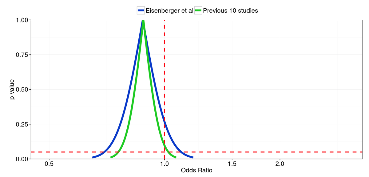
In summary, Eisenberger et al reported an Odds Ratio (OR) of 0·87 (95% CI 0·70, 1·10) in their trial, which they stated “does not result in a clinically meaningful improvement in survival”. An earlier meta-analysis, of the ten trials that preceded Eisenberger et al, found an OR of 0·88 (95% CI 0·76–1·02).
The plot below shows the p-value plot of the two ORs.
This figure makes it painfully obvious that the conclusion reached was probably due to a low power and small effect size. Of course in this case the meta-analysis will be the best source of evidence, but it’s still interesting to see the p-value functions of the current study, and the previous literature. I assume that properly thinking about the effect estimate and CI’s will lead to the same conclusion as plotting the p-value function, but the plot is still a great tool for putting what you are doing in your head down on paper.
How
# Install and load package from CRAN

  install.packages("episheet")
  load(episheet)

# Make the plot

  episheet::pvalueplot(
    est1.ll = 0.70,
    est1.ul = 1.10,
    est2.ll = 0.76,
    est2.ul = 1.02,
    label1 = "Eisenberger et al",
    label2 = "Previous studies",
    xlabel = "Odds Ratio"
)James Black
PhD (Cantab)
James Black. Kiwi | Epidemiologist | Data Scientist | Engineering enthusiast.