Converting relative risks into icons
Trying to find an easier way to display relative risks

Table of Contents
A 2018 paper1 (the last author was one of my PhD supervisors!) attempted to quantatively establish how people respond to the same information about risk communicated via different types of plots. The following four plots are what they showed participants. Figure 2b is the one I’m particularly interested in.

The follow up results from this study didn’t meet the primary objective of reported change in behaviour at 3 months2, but there were some more promising results in terms of changing immediate intention to be healthier.
There are some great tools to produce similar graphics, like the work by Professor Spiegelhalter that led to the RealRisk website.

Professor Spiegelhalter was the Professor for the Public Understanding of Risk at my university, and so I knew his work well enough that I tried to implement this plotting type in my PhD. While I would love to go back and update the caption and legend of this plot ..😳.. in the following plot I am trying to show the effect of intensive treatment with cardio-protective drugs from diagnosis of Type 2 diabetes, vs standard of care, within the first 15 years after diagnosis.
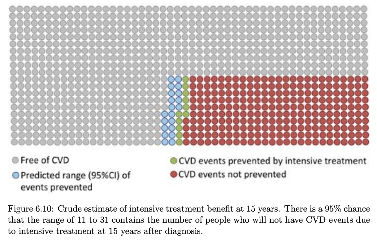
There are a few ways to get out the numbers for this. If it’s a trial with a binary outcome, you could even take the raw numbers. As an example, if 15% died by 5 years on intervention, and 20% in the control - you could make a square of 100 people and colour 15 red (as those that would have an event regardless), 5 green (number of events ‘prevented’) and 80 grey (no event regardless). Using the raw numbers has drawbacks though. You can’t communicate the uncertainty in those observed values, and you will present biased results if it was an observational study where they used regression adjustment to isolate the effect of one parameter.
To make the plots data more flexible, we can instead use a ‘baseline prevelance’, which is either the control group event rate, or an appropriate baseline prevelance/event rate from the literature. From this we can then contextualise the relative risk reported in the trials taking into account baseline prevalance.
Waffle plots and icon arrays
An R package exists for making these plots types (often called waffle plots
or icon arrays), called waffle. It seems to be a stale package with no
updates in the last 2 years, and it isn’t on CRAN.
The leap study plot re-imagined
LEAP in prior papers
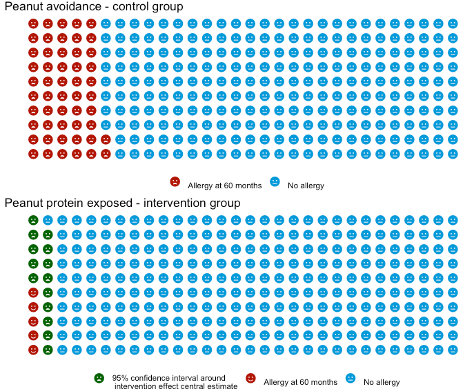
The following plot is a the primary result from the LEAP trial. I blogged about this trial in the past, but the short summary was it looked at whether early peanut exposure prevented peanut allergy onset by 60 months old.
The following plot is the primary result from the study, as the study authors plotted it.

While just comparing the prevalance of the outcome at 60 months works
in the RCT - it’s more common to see the same underlying data presented as a
risk ratio (or relative risk, abbreviated to RR).
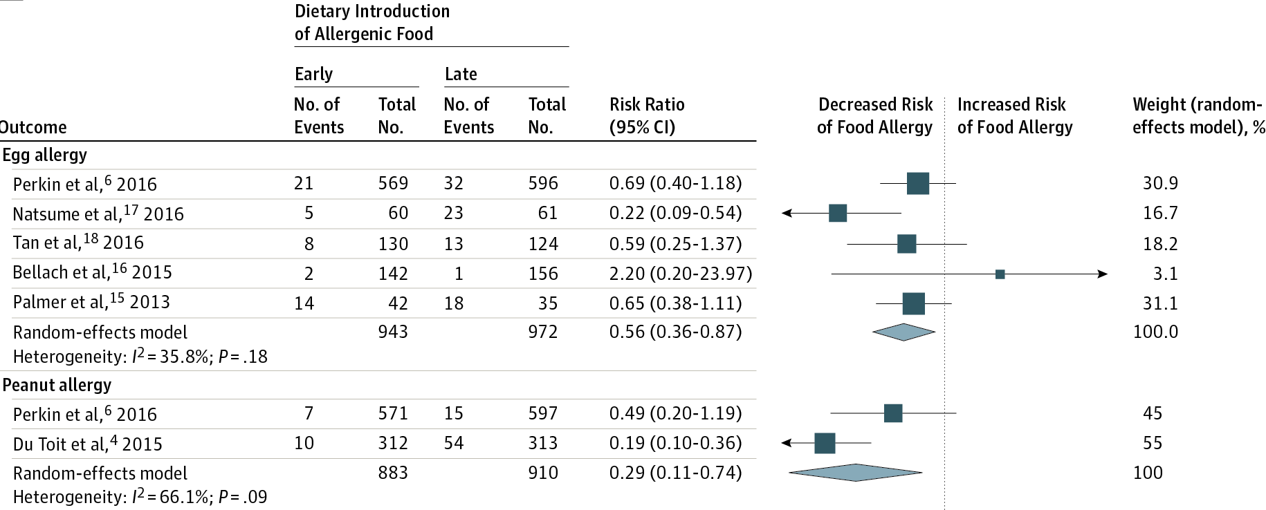
The LEAP results in the more familar RR format and visualised can be seen in this
JAMA meta-analysis (also covered in that earlier post). The LEAP trial appears in
this plot as De Toit et al, 2015.
My re-plots of LEAP as waffle plots
Using the waffle package, I first plot LEAP in a way that seems ‘aesthetically
pleasing’ - specifically, I set the base number of icons at 300, 1) as it was a good
blend between quantity (as more icons means less rounding), 2) it’s a small enough
number I can see the emoticon images and 3) it’s roughly similar to the size of the
study arms in LEAP. Huge caveat that the trial population is a high-risk group,
rather than the general population.
Next I follow it up repeating the results but rather than using the effect size estimate’s confidence interval, I use the raw observed numbers in the trial.
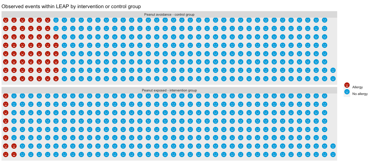
Both plots look similar, but there is a fundemantal difference in the two plots. The first plot I made is estimating the population effect size - so it’s not an exact number, hence the ‘range’ presented. While the second is presenting on this particular trials observed result, and there is no ‘uncertainty in what actually happened’.
For good measure, here is the plot using the two peanut studies referenced in the JAMA paper (LEAP and EAT). I show the EAT prevalance in it’s control arm as the first of the three sub-plots. Then the LEAP and EAT estimate of early peanut introduction impact on peanut allergy as the following two, using the EAT prevalance as the reference their effect estimates are applied to. Comparing this plot to the earlier one highlights that a relative risk of 0.19 means quite different things in terms of overall population impact depending on the baseline prevalence.
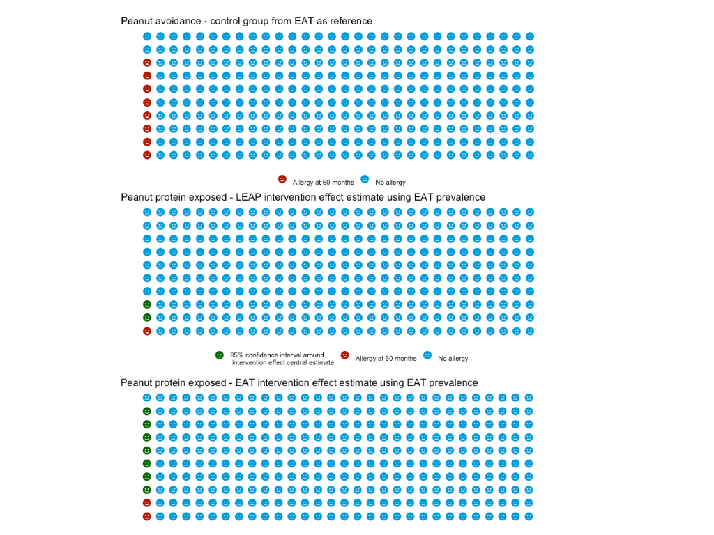
These plots are a useful way to provide further context to a relative risk against baseline prevalences, and a simple way to represent actual event rates. One concern I do have though is that I feel they lack direct comparability. E.g. in a bar plot of two prevalances, or in a forest plot, it is very easy to see which value is larger or smaller. In these plots where the difference could only be a handful of icons they seem like they are harder to intepret. An example being the last plot- it’s not immediately appearent the EAT study 95% confidence interval spans both sides of the reference prevalence.
So maybe not something I’ll always turn to - but a useful plot type, that I think I will employ at some point when dealing with lay audiences and where there is a large effect size.
They are also very easy to do! The gist below generates the second of my plots.
Usher-Smith et al. (2018) A randomised controlled trial of the effect of providing online risk information and lifestyle advice for the most common preventable cancers: Study protocol. BMC Public Health. 18. 796. 10.1186/s12889-018-5712-2. ↩︎
Golnessa et al. (2020) A randomised controlled trial of the effect of providing online risk information and lifestyle advice for the most common preventable cancers, Preventive Medicine, Volume 138, https://doi.org/10.1016/j.ypmed.2020.106154. ↩︎
James Black
PhD (Cantab)
James Black. Kiwi | Epidemiologist | Data Scientist | Engineering enthusiast.